|
Jakstar's Graphics | CLOSED!!
|
| lluuiiggii |
Posted on 27-01-2013 01:25
|
Grand Tour Champion

Posts: 8425
Joined: 30-07-2010
PCM$: 200.00
|
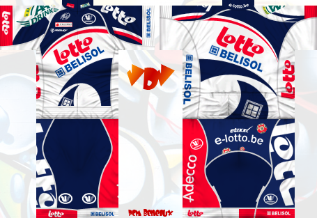
The one I prefer the most is the rise effect. You'll need to change the warp orientation for the side logos though (between the drop down menu and the bend value box, in Photoshop). Then also notice that to make the top of the logo smaller, you should change the "V" value, not the "H". It's fairly simple to do, but I just hope this makes any sense 
|
| |
|
|
| maxime86 |
Posted on 27-01-2013 03:02
|
Classics Specialist

Posts: 2941
Joined: 01-03-2012
PCM$: 200.00
|
Hey jak, could you make me a jersey with these sponsors:
Main Sponsors:
In-n-Out:
Bontrager:
Minor Sponsors:
Trek:
Nike:
San Jose Earthquakes:
|
| |
|
|
| fcancellara |
Posted on 27-01-2013 03:04
|

Grand Tour Specialist

Posts: 4813
Joined: 18-08-2011
PCM$: 200.00
|
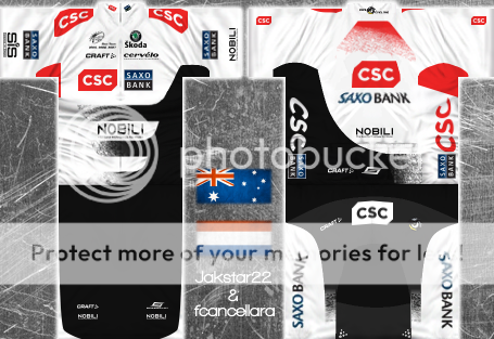
Updated:

|
| |
|
|
| lluuiiggii |
Posted on 27-01-2013 03:34
|

Grand Tour Champion

Posts: 8425
Joined: 30-07-2010
PCM$: 200.00
|
Sleeves should look fine now, perhaps the Saxo/SIS/Nobili logo could even be moved a bit further up but they should look better where they are. I'm not sure what sort of effect you applied at the sponsors at the back, normally I just go with normal perspective (Ctrl + T, right click, perspective, change the thingies at the corners).
Concerning the Saxo logos in the shorts, I didn't mention they should be curved because looking at the Viewer they don't seem to need to be curved in this case, since the logo is quite small (if they were a bit higher though they perhaps should be curved). Additionally, the curved part has lost some quality, seems quite blurred. Did you do it with Ctrl+T, Free Transform and then do it manually? If yes I found that this way does indeed leave the logos blurry. Try the method anderspcm posted in the Tips and Tricks:
https://pcmdaily.com/tipstricks.php?ti...p?tipid=55
Finally, I'm not sure what effects you applied at the side CSC logos but I don't think this way they'll look much better than the previous version  It should be like this: It should be like this:

Which can be achieved with these settings:

Note the circled button. That's where you change warp orientation (the thing I mentioned in the earlier post), you need to change that for the side logos. Also notice that when make the top of the logo smaller by changing the V value, you'll be making the "base" larger, so if you have a big logo which you'll need to make very tiny at the top you should, before applying the rize effect, make it smaller than it actually should be (again, if this makes any sense  ). ).
|
| |
|
|
| Jakstar22 |
Posted on 27-01-2013 07:06
|

Grand Tour Champion

Posts: 7656
Joined: 11-04-2012
PCM$: 200.00
|
The jersey looks good. And thanks lluuiiggii for all your help and long long posts of how to do something that i don't get but I'm sure Casper does.
And sure Maxime
Edited by Jakstar22 on 27-01-2013 07:06
|
| |
|
|
| Jakstar22 |
Posted on 27-01-2013 13:22
|

Grand Tour Champion

Posts: 7656
Joined: 11-04-2012
PCM$: 200.00
|
I hae mae a jersey but it isn't finished. I want some ideas from you guys.

Thanks
Jak
|
| |
|
|
| Ian Butler |
Posted on 27-01-2013 13:24
|

Tour de France Champion

Posts: 21379
Joined: 01-05-2012
PCM$: 400.00
|
Maybe you could add another color? Preferably on the arm, or two horizontal stripes under all4cycling? |
| |
|
|
| FroomeDog99 |
Posted on 27-01-2013 13:26
|

Grand Tour Specialist

Posts: 4461
Joined: 07-10-2012
PCM$: 200.00
|
Jakstar22 wrote:
I hae mae a jersey but it isn't finished. I want some ideas from you guys.

Thanks
Jak
Really pixelated orange shapes and Wiggle logo. Try to improve their quality by using colorise |
| |
|
|
| Jakstar22 |
Posted on 27-01-2013 13:28
|

Grand Tour Champion

Posts: 7656
Joined: 11-04-2012
PCM$: 200.00
|
FroomeDog99 wrote:
Jakstar22 wrote:
I hae mae a jersey but it isn't finished. I want some ideas from you guys.

Thanks
Jak
Really pixelated orange shapes and Wiggle logo. Try to improve their quality by using colorise
I'm not o Gimp. I'm on Paint.net
|
| |
|
|
| Jakstar22 |
Posted on 27-01-2013 13:32
|

Grand Tour Champion

Posts: 7656
Joined: 11-04-2012
PCM$: 200.00
|
Ian Butler wrote:
Maybe you could add another color? Preferably on the arm, or two horizontal stripes under all4cycling?
Like this?

|
| |
|
|
| Ad Bot |
Posted on 02-05-2026 10:09
|
Bot Agent
Posts: Countless
Joined: 23.11.09
|
|
| IP: None |
|
|
| miggi133 |
Posted on 27-01-2013 14:18
|

Classics Specialist

Posts: 2992
Joined: 19-08-2009
PCM$: 200.00
|
Still very pixelated... Im guessing you chose the shorts from somebody elses jersey? Give them credit for that
The stripes in the chest and upper back area are also very pixelated.
The b and e letters on the back dont look that good if you keep them in black. make em white, maybe?
I liked the style of the jersey more before you added thos two stripes on the front btw. Not completely walking away from the stripes, why dont you make a grey and an orange stripe on the the sleeves?
And maybe add some sponsors to the chest area and the sleeves...
Thatll be all 
But this jersey is a definite improvement upon your last work!
EDIT: By the way, your avatar is really ... call it ... for a lack of a better word ... Disturbing...
Edited by miggi133 on 27-01-2013 14:20
|
| |
|
|
| Jakstar22 |
Posted on 27-01-2013 14:24
|

Grand Tour Champion

Posts: 7656
Joined: 11-04-2012
PCM$: 200.00
|
miggi133 wrote:
Still very pixelated... Im guessing you chose the shorts from somebody elses jersey? Give them credit for that
The stripes in the chest and upper back area are also very pixelated.
The b and e letters on the back dont look that good if you keep them in black. make em white, maybe?
I liked the style of the jersey more before you added thos two stripes on the front btw. Not completely walking away from the stripes, why dont you make a grey and an orange stripe on the the sleeves?
And maybe add some sponsors to the chest area and the sleeves...
Thatll be all 
But this jersey is a definite improvement upon your last work!
EDIT: By the way, your avatar is really ... call it ... for a lack of a better word ... Disturbing...
Thanks for the advice. I will see what I can do.
And tell fcancellara that the avatar he MADE is disturbing.
|
| |
|
|
| lluuiiggii |
Posted on 27-01-2013 14:34
|

Grand Tour Champion

Posts: 8425
Joined: 30-07-2010
PCM$: 200.00
|
miggi133 wrote:
Still very pixelated... Im guessing you chose the shorts from somebody elses jersey? Give them credit for that

|
| |
|
|
| Jakstar22 |
Posted on 27-01-2013 14:41
|

Grand Tour Champion

Posts: 7656
Joined: 11-04-2012
PCM$: 200.00
|
lluuiiggii's got it. I got it off VDV's jersey
|
| |
|
|
| fcancellara |
Posted on 27-01-2013 14:41
|

Grand Tour Specialist

Posts: 4813
Joined: 18-08-2011
PCM$: 200.00
|
lluuiiggii wrote:
Sleeves should look fine now, perhaps the Saxo/SIS/Nobili logo could even be moved a bit further up but they should look better where they are. I'm not sure what sort of effect you applied at the sponsors at the back, normally I just go with normal perspective (Ctrl + T, right click, perspective, change the thingies at the corners).
Concerning the Saxo logos in the shorts, I didn't mention they should be curved because looking at the Viewer they don't seem to need to be curved in this case, since the logo is quite small (if they were a bit higher though they perhaps should be curved). Additionally, the curved part has lost some quality, seems quite blurred. Did you do it with Ctrl+T, Free Transform and then do it manually? If yes I found that this way does indeed leave the logos blurry. Try the method anderspcm posted in the Tips and Tricks:
https://pcmdaily.com/tipstricks.php?ti...p?tipid=55
Finally, I'm not sure what effects you applied at the side CSC logos but I don't think this way they'll look much better than the previous version  It should be like this:

Which can be achieved with these settings:

Note the circled button. That's where you change warp orientation (the thing I mentioned in the earlier post), you need to change that for the side logos. Also notice that when make the top of the logo smaller by changing the V value, you'll be making the "base" larger, so if you have a big logo which you'll need to make very tiny at the top you should, before applying the rize effect, make it smaller than it actually should be (again, if this makes any sense  ).
I'll fix it 
|
| |
|
|
| Jakstar22 |
Posted on 27-01-2013 15:10
|

Grand Tour Champion

Posts: 7656
Joined: 11-04-2012
PCM$: 200.00
|
Is this better? I have made a few changes to the jersey.

A Ferrari jersey I decided to make

What do you think?
Edited by Jakstar22 on 27-01-2013 15:12
|
| |
|
|
| SSJ2Luigi |
Posted on 27-01-2013 15:12
|

World Champion

Posts: 11469
Joined: 21-07-2012
PCM$: 400.00
|
the wiggle logo and the B(cycling guy)E look pixelated along with the orange lines
|
| |
|
|
| Jakstar22 |
Posted on 27-01-2013 15:16
|

Grand Tour Champion

Posts: 7656
Joined: 11-04-2012
PCM$: 200.00
|
SSJ2Luigi wrote:
the wiggle logo and the B(cycling guy)E look pixelated along with the orange lines
The orange lines are like that because I was moving them around a lot and because I fail on draing them. And the writing is because I was in too much of a percentage thing (76% on Paint.net) an when I used the paint bucket it filled it in a bit too much so yeh.
|
| |
|
|
| miggi133 |
Posted on 27-01-2013 15:21
|

Classics Specialist

Posts: 2992
Joined: 19-08-2009
PCM$: 200.00
|
The Puma logos on the sleeves are upside down...
And it is still pixelated..
|
| |
|
|
| Jakstar22 |
Posted on 27-01-2013 15:23
|

Grand Tour Champion

Posts: 7656
Joined: 11-04-2012
PCM$: 200.00
|
miggi133 wrote:
The Puma logos on the sleeves are upside down...
And it is still pixelated..
That pixelation won't get fixed cause I can't. I tried a lttle bit ago and it didn't work. But I wil change the Puma logo's around
|
| |
|


