|
Mithrillian's Graphics - CLOSED
|
|
| Ad Bot |
Posted on 02-05-2026 00:36
|
Bot Agent
Posts: Countless
Joined: 23.11.09
|
|
| IP: None |
|
|
| jordynoel789 |
Posted on 29-12-2012 16:45
|

Neo-Pro

Posts: 350
Joined: 08-04-2012
PCM$: 200.00
|
it looks weird to me |
| |
|
|
| Mithrillian |
Posted on 29-12-2012 16:48
|

Domestique

Posts: 421
Joined: 05-07-2012
PCM$: 200.00
|
jordynoel789 wrote:
it looks weird to me
What looks weird and what's weird about it? i don't understand mate. Cant fix it if I dont get it. |
| |
|
|
| jordynoel789 |
Posted on 29-12-2012 16:51
|

Neo-Pro

Posts: 350
Joined: 08-04-2012
PCM$: 200.00
|
just change the color
how do you make that bubbles with gimp where can i find it?
|
| |
|
|
| Mithrillian |
Posted on 29-12-2012 16:56
|

Domestique

Posts: 421
Joined: 05-07-2012
PCM$: 200.00
|
jordynoel789 wrote:
just change the color
how do you make that bubbles with gimp where can i find it?
Mavic's real logo is yellow mate, I didn't make it like that because I like it that way.
Those 'bubbles' are small versions of the thompson logo put alongside eachother. Just grab the logo, side it down and put it on the jersey.
EDIT: Which 'shapes' are you referring to when you asked to put the accent color on it? The gradient thompson pattern?
Edited by Mithrillian on 29-12-2012 17:00
|
| |
|
|
| jordynoel789 |
Posted on 29-12-2012 17:36
|

Neo-Pro

Posts: 350
Joined: 08-04-2012
PCM$: 200.00
|
yeah |
| |
|
|
| Mithrillian |
Posted on 29-12-2012 18:19
|

Domestique

Posts: 421
Joined: 05-07-2012
PCM$: 200.00
|
jordynoel789 wrote:
yeah
It's fresher like that. I agree it's better.
EDIT: Anything else you want? Otherwise I'll start doing NC's and stuff.
Edited by Mithrillian on 29-12-2012 18:20
|
| |
|
|
| jordynoel789 |
Posted on 29-12-2012 19:12
|

Neo-Pro

Posts: 350
Joined: 08-04-2012
PCM$: 200.00
|
Mithrillian wrote:
jordynoel789 wrote:
yeah
It's fresher like that. I agree it's better.
EDIT: Anything else you want? Otherwise I'll start doing NC's and stuff.
could you put for example the mavic logo on the pants and make it white and on the other side for example thompson |
| |
|
|
| Mithrillian |
Posted on 29-12-2012 19:32
|

Domestique

Posts: 421
Joined: 05-07-2012
PCM$: 200.00
|
jordynoel789 wrote:
Mithrillian wrote:
jordynoel789 wrote:
yeah
It's fresher like that. I agree it's better.
EDIT: Anything else you want? Otherwise I'll start doing NC's and stuff.
could you put for example the mavic logo on the pants and make it white and on the other side for example thompson
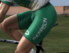
Did them both on one leg and made a screenshot in cyclist editor. Mavic looks better but is less important. Do note though, Mavic is supposed to be yellow.
Which one do you prefer?


Edited by Mithrillian on 29-12-2012 19:48
|
| |
|
|
| jordynoel789 |
Posted on 29-12-2012 22:17
|

Neo-Pro

Posts: 350
Joined: 08-04-2012
PCM$: 200.00
|
Mithrillian wrote:
jordynoel789 wrote:
Mithrillian wrote:
jordynoel789 wrote:
yeah
It's fresher like that. I agree it's better.
EDIT: Anything else you want? Otherwise I'll start doing NC's and stuff.
could you put for example the mavic logo on the pants and make it white and on the other side for example thompson
Did them both on one leg and made a screenshot in cyclist editor. Mavic looks better but is less important. Do note though, Mavic is supposed to be yellow.
Which one do you prefer?


could you make thompson bigger |
| |
|
|
| Mithrillian |
Posted on 29-12-2012 22:35
|

Domestique

Posts: 421
Joined: 05-07-2012
PCM$: 200.00
|
jordynoel789 wrote:
Mithrillian wrote:
jordynoel789 wrote:
Mithrillian wrote:
jordynoel789 wrote:
yeah
It's fresher like that. I agree it's better.
EDIT: Anything else you want? Otherwise I'll start doing NC's and stuff.
could you put for example the mavic logo on the pants and make it white and on the other side for example thompson
Did them both on one leg and made a screenshot in cyclist editor. Mavic looks better but is less important. Do note though, Mavic is supposed to be yellow.
Which one do you prefer?


could you make thompson bigger
I can, but it's not worth the effort. It'll distort and won't look good, I'm afraid.
 ''The thing I love about PCM is that no other game requires a guide where the sentence "Acceleration does not mean acceleration" is used.''
 - cactus-jack |
| |
|
|
| lluuiiggii |
Posted on 30-12-2012 00:38
|
Grand Tour Champion

Posts: 8425
Joined: 30-07-2010
PCM$: 200.00
|
Mithrillian wrote:
I can, but it's not worth the effort. It'll distort and won't look good, I'm afraid.
Go back to the original logo and re-size it again  (unless you couldn't find a logo bigger than that, but I hardly think so (unless you couldn't find a logo bigger than that, but I hardly think so  ) )
On that jersey specifically: since it has several sponsors, I guess it'd look nice if you place a miniature of each of them near the collar in the front, like most real life jerseys do 
On all jerseys and thread: that's a very nice start, keep it up 
|
| |
|
|
| Mithrillian |
Posted on 30-12-2012 10:52
|

Domestique

Posts: 421
Joined: 05-07-2012
PCM$: 200.00
|
lluuiiggii wrote:
Mithrillian wrote:
I can, but it's not worth the effort. It'll distort and won't look good, I'm afraid.
Go back to the original logo and re-size it again  (unless you couldn't find a logo bigger than that, but I hardly think so  )
On that jersey specifically: since it has several sponsors, I guess it'd look nice if you place a miniature of each of them near the collar in the front, like most real life jerseys do 
On all jerseys and thread: that's a very nice start, keep it up 
Hmm... Seems fair.. Could try that.
I could resize it again but I tried such thing on my belgacom jersey too, it starts distorting. Might have a go at it though, yesterday was from my iPad.
 ''The thing I love about PCM is that no other game requires a guide where the sentence "Acceleration does not mean acceleration" is used.''
 - cactus-jack |
| |
|
|
| Mithrillian |
Posted on 30-12-2012 11:07
|

Domestique

Posts: 421
Joined: 05-07-2012
PCM$: 200.00
|
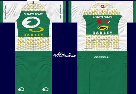
How does this look, better?
EDIT: Whoops wrong one. Does anyone know how to get my banner to be linking to this thread? Thanks.
Edited by Mithrillian on 30-12-2012 11:08
 ''The thing I love about PCM is that no other game requires a guide where the sentence "Acceleration does not mean acceleration" is used.''
 - cactus-jack |
| |
|
|
| TheManxMissile |
Posted on 30-12-2012 11:10
|

Tour de France Champion

Posts: 17881
Joined: 12-05-2012
PCM$: 0.00
|
[url=putlinkadresshere][img]putimagehere[/img][/url]
Edited by TheManxMissile on 30-12-2012 11:11
|
| |
|
|
| the_hoyle |
Posted on 30-12-2012 11:11
|
Grand Tour Champion

Posts: 7592
Joined: 28-05-2009
PCM$: 300.00
|
Mithrillian wrote:
Does anyone know how to get my banner to be linking to this thread? Thanks.
here is how you do it:
[url=insert the hyperlink to your thread here][img]Insert the Image link here[/img][/url]
EDIT: Zabel'd by TMM
Edited by the_hoyle on 30-12-2012 11:12
.: Manager of :.
 .: My Awards :.


 |
| |
|
|
| Mithrillian |
Posted on 30-12-2012 11:18
|

Domestique

Posts: 421
Joined: 05-07-2012
PCM$: 200.00
|
Testing 1, 2, 3...
Works brilliantly. Thanks Manx/hoyle
Edited by Mithrillian on 30-12-2012 11:19
 ''The thing I love about PCM is that no other game requires a guide where the sentence "Acceleration does not mean acceleration" is used.''
 - cactus-jack |
| |
|
|
| Mithrillian |
Posted on 31-12-2012 15:51
|

Domestique

Posts: 421
Joined: 05-07-2012
PCM$: 200.00
|
Jordy are you ok with the jersey? Because if you are I'll start makinh the nationals and post them as a pack.
 ''The thing I love about PCM is that no other game requires a guide where the sentence "Acceleration does not mean acceleration" is used.''
 - cactus-jack |
| |
|
|
| jordynoel789 |
Posted on 31-12-2012 16:33
|

Neo-Pro

Posts: 350
Joined: 08-04-2012
PCM$: 200.00
|
wich jersey i don't see anything ? |
| |
|
|
| Mithrillian |
Posted on 31-12-2012 16:36
|

Domestique

Posts: 421
Joined: 05-07-2012
PCM$: 200.00
|
jordynoel789 wrote:
wich jersey i don't see anything ?
The one that's been taking uys so long. The Thompson - Oakley. Just look at the last png file of it + thompson on the left and mavic (white) on the right leg.
 ''The thing I love about PCM is that no other game requires a guide where the sentence "Acceleration does not mean acceleration" is used.''
 - cactus-jack |
| |
|
|
| jordynoel789 |
Posted on 31-12-2012 16:41
|

Neo-Pro

Posts: 350
Joined: 08-04-2012
PCM$: 200.00
|
oh that yeah you can start |
| |
|




 (unless you couldn't find a logo bigger than that, but I hardly think so
  )
)


