|
Graphics by the_hoyle | Requests OPEN
|
| the_hoyle |
Posted on 05-08-2015 12:02
|
Grand Tour Champion

Posts: 7592
Joined: 28-05-2009
PCM$: 300.00
|
@MARS: Yes I see them as more of a PCT team than WT like Movistar
.: Manager of :.
 .: My Awards :.


 |
| |
|
|
| MARSUPILAMI |
Posted on 05-08-2015 12:21
|

Team Leader

Posts: 5573
Joined: 10-08-2013
PCM$: 300.00
|
Ok, that's a good point of view
Why don't you create a new PCM 15 thread?
I mean, it's more comfortable to just look into one subforum, than looking into two
|
| |
|
|
| the_hoyle |
Posted on 05-08-2015 12:46
|

Grand Tour Champion

Posts: 7592
Joined: 28-05-2009
PCM$: 300.00
|
@MARS: I think I will start a PCM15 thread after my current pack
.: Manager of :.
 .: My Awards :.


 |
| |
|
|
| Wild Dog |
Posted on 05-08-2015 16:37
|
Domestique

Posts: 423
Joined: 17-07-2011
PCM$: 200.00
|
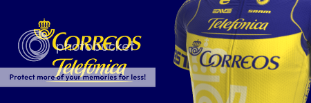
The Correos jersey is beautiful. Really difficult to choose if it's yours' or MARS' that's the best one. One thing that 'hurts' your shirt, is the fact that you didn't use 'Correos blue'... But I like your design a bit more than I like MARS' design. 
EDIT: Ohh, and how do you do so it's only the shirt and not all of photobucket that opens in a new window when you click the shirt? 
Edited by Wild Dog on 05-08-2015 16:43
Vincenzo Nibali - Rui Costa - Nairo Quintana - Alberto Contador - Peter Sagan
WDshirts
The Last of the Real
- Story about Dries Deckers - racing against Merckx, de Vlaeminck etc. |
| |
|
|
| the_hoyle |
Posted on 05-08-2015 17:42
|

Grand Tour Champion

Posts: 7592
Joined: 28-05-2009
PCM$: 300.00
|
@Wild: The blue came from Telefonica and looks nicer when the two are combined. Telefonica logo with the Correos Blue didn't look the same.
You can find the fix to the photobucket link problem in the trixks and tips. It is a case of unlinking the album in settings. I'm on my phone at the minute so can't properly advise on the steps
.: Manager of :.
 .: My Awards :.


 |
| |
|
|
| the_hoyle |
Posted on 05-08-2015 21:06
|

Grand Tour Champion

Posts: 7592
Joined: 28-05-2009
PCM$: 300.00
|
Here are the NCs for the Correos-Telefonica pack - 6 in total, and slightly influenced by the Lampre style of NC found in the Expansion Packs
Credit to EvilGaming for his collection of NCs
Edited by the_hoyle on 06-08-2015 08:47
.: Manager of :.
 .: My Awards :.


 |
| |
|
|
| Ad Bot |
Posted on 02-05-2026 10:16
|
Bot Agent
Posts: Countless
Joined: 23.11.09
|
|
| IP: None |
|
|
| MARSUPILAMI |
Posted on 06-08-2015 08:27
|

Team Leader

Posts: 5573
Joined: 10-08-2013
PCM$: 300.00
|
In "Brazil", you have posted the Portuguese NC. So the Portuguese is twice in that post 
PD: Why is your album private?
|
| |
|
|
| the_hoyle |
Posted on 06-08-2015 08:48
|

Grand Tour Champion

Posts: 7592
Joined: 28-05-2009
PCM$: 300.00
|
Updated with Brazil NC now
.: Manager of :.
 .: My Awards :.


 |
| |
|
|
| MARSUPILAMI |
Posted on 06-08-2015 08:54
|

Team Leader

Posts: 5573
Joined: 10-08-2013
PCM$: 300.00
|
Loving Spanish NC 
Brazilian is also extremely good. The others... fine!
|
| |
|
|
| the_hoyle |
Posted on 09-08-2015 12:48
|

Grand Tour Champion

Posts: 7592
Joined: 28-05-2009
PCM$: 300.00
|
 Correos - Telefonica Correos - Telefonica 
Pack includes:
- Main Jersey
- 6 NC Jerseys
- All Accessories
- Logo
- Mini Maillot
- Background Maillot
.: Manager of :.
 .: My Awards :.


 |
| |
|
|
| MARSUPILAMI |
Posted on 10-08-2015 16:02
|

Team Leader

Posts: 5573
Joined: 10-08-2013
PCM$: 300.00
|
Have just seen this. That's incredible, believe me!
Just a question. Why do you "only" make 6 NCs? What about making more NCs for each Pack (15 could be good, why not)? Having templates, everything is much easier!
|
| |
|
|
| the_hoyle |
Posted on 10-08-2015 16:04
|

Grand Tour Champion

Posts: 7592
Joined: 28-05-2009
PCM$: 300.00
|
@Mars: it was always designed to be a small pack, with a Spanish/Portuguese feel. It is aimmed at being a PCT team so 15 NCs would be unrealistic
.: Manager of :.
 .: My Awards :.


 |
| |
|
|
| MARSUPILAMI |
Posted on 10-08-2015 16:08
|

Team Leader

Posts: 5573
Joined: 10-08-2013
PCM$: 300.00
|
Not at all. A pack with lots of NCs can't be named unrealistic... but COMPLETE!
Your packs are very good, with TOP quality (83 in PCM), but I would make some more content, also because you use templates in almost all of your NC designs (other people use the design of the shirt, which is better for quality, but worse for quantity).
Hope you understand me, don't get angry 
|
| |
|
|
| the_hoyle |
Posted on 10-08-2015 17:39
|

Grand Tour Champion

Posts: 7592
Joined: 28-05-2009
PCM$: 300.00
|
@Mars: as I said, it is aimmed to be PCT team that focuses on Spanish and Portuguese speaking riders. Adding NCs for aus, gbr, fra etc just to make it larger is unrealistic for the idea I had. The number of NCs in each pack will differ depending on the sponsors and which NCs realistically work with it, regardless of whether I use an NC Template base or not
.: Manager of :.
 .: My Awards :.


 |
| |
|
|
| the_hoyle |
Posted on 11-08-2015 13:27
|

Grand Tour Champion

Posts: 7592
Joined: 28-05-2009
PCM$: 300.00
|
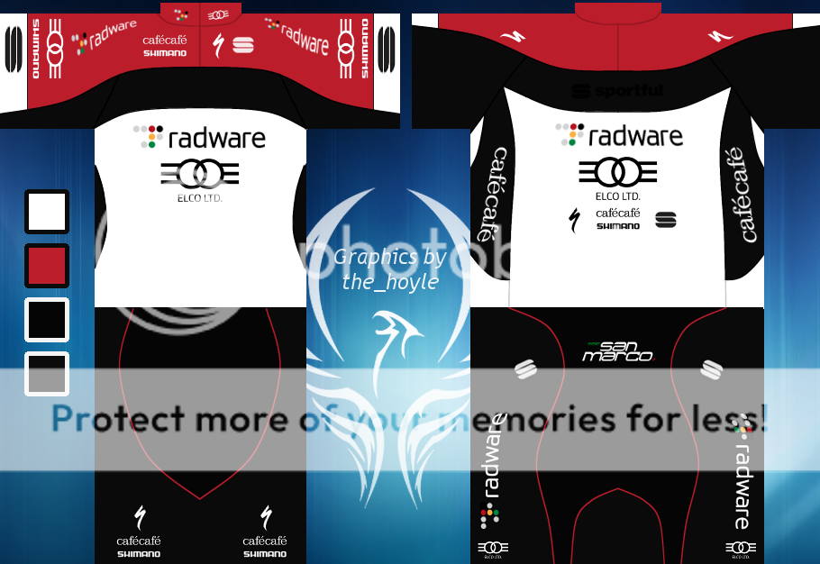
Made for sgdanny's Next Gen DB
 Radware - Elco p/b CaféCafé Cycling Radware - Elco p/b CaféCafé Cycling 
This is going to be a standalone jersey with no full pack to follow - only Israel NC and accessories to be made, as requested by sgdanny
.: Manager of :.
 .: My Awards :.


 |
| |
|
|
| Wild Dog |
Posted on 11-08-2015 16:08
|

Domestique

Posts: 423
Joined: 17-07-2011
PCM$: 200.00
|
Beautiful shirt @the_hoyle!
Vincenzo Nibali - Rui Costa - Nairo Quintana - Alberto Contador - Peter Sagan
WDshirts
The Last of the Real
- Story about Dries Deckers - racing against Merckx, de Vlaeminck etc. |
| |
|
|
| MARSUPILAMI |
Posted on 11-08-2015 16:14
|

Team Leader

Posts: 5573
Joined: 10-08-2013
PCM$: 300.00
|
Good job. Not too impressive for me, but it's good, as always!
Looking forward to see transferts and so
|
| |
|
|
| Paul23 |
Posted on 11-08-2015 16:48
|

Grand Tour Specialist

Posts: 4394
Joined: 10-08-2011
PCM$: 400.00
|
Great one. Would've loved orange instead of that red, but I guess its due some sponsor, still the design looks fantastic 
|
| |
|
|
| the_hoyle |
Posted on 11-08-2015 17:27
|

Grand Tour Champion

Posts: 7592
Joined: 28-05-2009
PCM$: 300.00
|
@wd: thanks a lot
@mars: the jersey fitted with dannys requirements and he is happy with the results. Accessories will be basic, and will not be published. As I said it was a standalone jersey for my thread.
@paul: the red came from the radware website. It was the main colour other than black and white used.
*****
This evening will see the release of the African based jersey, as suggested by sammy. This will be a large pack, focusing on a parge majority of the African nations.
.: Manager of :.
 .: My Awards :.


 |
| |
|
|
| the_hoyle |
Posted on 11-08-2015 19:56
|

Grand Tour Champion

Posts: 7592
Joined: 28-05-2009
PCM$: 300.00
|
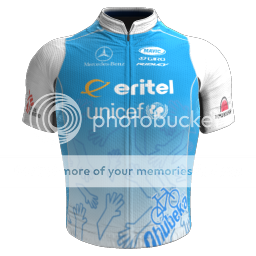
 Eritel-Unicef Cycling Eritel-Unicef Cycling 
Many different influences for the jersey and the choice of sponsors. Eritel was the only one who stood out in terms of the Eritrean based companies, so that was an easy choice.
The rest are companies who have a big presence in Africa, in particularly, that area of Africa. Qhubeka hands comes from the MTN jersey from last season, and credits to the many different members who recreated the jersey for the placement of the hands.
Other minor sponsors were picked to fit the jersey.
.: Manager of :.
 .: My Awards :.


 |
| |
|


 Correos - Telefonica
 Radware - Elco p/b CaféCafé Cycling


 Eritel-Unicef Cycling