|
Jakstar's Graphics | CLOSED!!
|
| Jakstar22 |
Posted on 22-01-2013 21:47
|

Grand Tour Champion

Posts: 7675
Joined: 11-04-2012
PCM$: 200.00
|
miggi133 wrote:
lluuiiggii wrote:
Very simple. To be honest, it just looks like some sponsor logos thrown randomly on the shirt along with colored sides and shorts. What I would say you could do is google 'cycling jersey' and try to recreate some of the designs, or at least take inspiration on them. Then you can change the sponsors for the ones you want, and so on. Miggi said he's been doing that and he's been producing some fantastic shirts lately 
Btw, the logo qualities are good, although the Colnago one looks too wide (distorted).
What can I say, They are a superb source of inspiration...
But yeah, I use them quite often lately, cause I virtually ran out of any creative ideas, since I had basically done everything that came to mind (And Worked Of course!)...
I can really recommend that approach though...
Well I guess if even Miggi suggests it I will do it. I will post some jerseys when I have done them.
|
| |
|
|
| miggi133 |
Posted on 23-01-2013 00:19
|

Classics Specialist

Posts: 2992
Joined: 19-08-2009
PCM$: 200.00
|
Here is the Plis you wanted...
|
| |
|
|
| Jakstar22 |
Posted on 23-01-2013 00:21
|
Grand Tour Champion
Posts: 7675
Joined: 11-04-2012
PCM$: 200.00
|
Thanks Miggi.
|
| |
|
|
| Jakstar22 |
Posted on 24-01-2013 05:18
|
Grand Tour Champion
Posts: 7675
Joined: 11-04-2012
PCM$: 200.00
|
Here is a jersey from last year but I think I did pretty well. Here is the RNT jersey from 2012.

What do you guys think?
|
| |
|
|
| lluuiiggii |
Posted on 24-01-2013 05:25
|
Grand Tour Champion
Posts: 8425
Joined: 30-07-2010
PCM$: 200.00
|
That's a great job indeed, well done!  A couple of things that could be better are the sponsors on the shoulders, and the red shape around the Radioshack logo, which are a bit pixelated. But other than that it looks good, correct positioning for sponsors and so on A couple of things that could be better are the sponsors on the shoulders, and the red shape around the Radioshack logo, which are a bit pixelated. But other than that it looks good, correct positioning for sponsors and so on
And you know one thing I find great about recreating shirts from the bigger teams? You can then compare your version with the other versions, especially the ones by the best shirt makers, and see what they did different, what you could have done, etc Btw, haven't I seen those shorts somewhere?
|
| |
|
|
| Jakstar22 |
Posted on 24-01-2013 05:29
|
Grand Tour Champion
Posts: 7675
Joined: 11-04-2012
PCM$: 200.00
|
Thanks luuiiggii 
And the shorts are on the team jersey in real life so yes and on DennisMenchov version and VDV version
|
| |
|
|
| Ian Butler |
Posted on 24-01-2013 08:42
|

Tour de France Champion

Posts: 21379
Joined: 01-05-2012
PCM$: 400.00
|
Radioshack looks very good! Only, like lluuiiggii said, the red marking around the name are a bit off. But great job nevertheless! |
| |
|
|
| Jakstar22 |
Posted on 26-01-2013 22:38
|
Grand Tour Champion
Posts: 7675
Joined: 11-04-2012
PCM$: 200.00
|
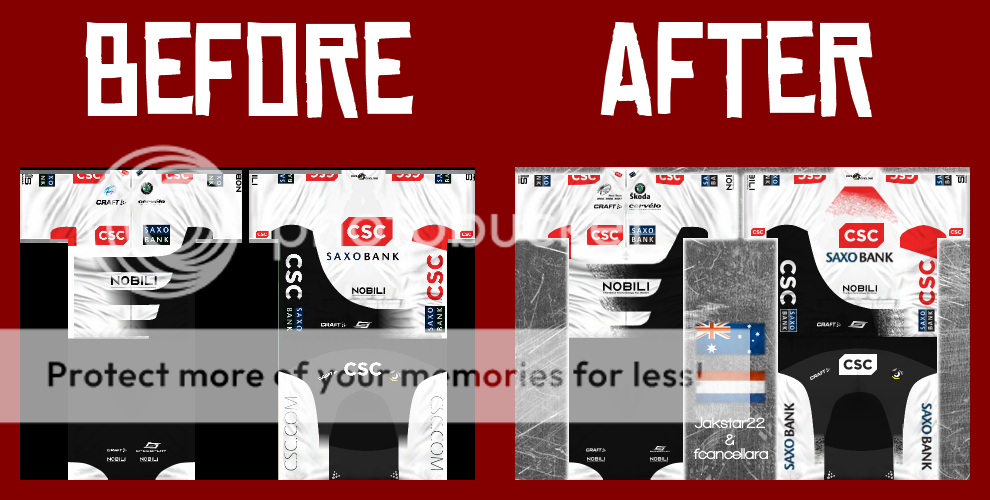
Here is a jersey me and fcancellara made
CSC - Saxobank
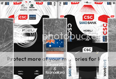
What do you think?
|
| |
|
|
| Jesleyh |
Posted on 26-01-2013 22:43
|
World Champion
Posts: 14744
Joined: 21-07-2012
PCM$: 200.00
|
It's great, maybe your best one until now
Casper has a good influence I guess
Feyenoord(football) and Kelderman fanboy
PCMdaily Awards: 12x nomination, 9x runner-up, 0x win.
|
| |
|
|
| Ad Bot |
Posted on 16-06-2026 13:17
|
Bot Agent
Posts: Countless
Joined: 23.11.09
|
|
| IP: None |
|
|
| Bikex |
Posted on 26-01-2013 22:45
|

Team Leader
Posts: 7437
Joined: 25-08-2012
PCM$: 600.00
|
I like it and I also like your new avatar |
| |
|
|
| lluuiiggii |
Posted on 26-01-2013 22:46
|
Grand Tour Champion
Posts: 8425
Joined: 30-07-2010
PCM$: 200.00
|
It looks great, but I think the point of Jaap asking the shirts to be recreated was that they were made in PCM11-12 style? Otherwise he could just have used the PCM08 ones 
|
| |
|
|
| Jakstar22 |
Posted on 26-01-2013 22:46
|
Grand Tour Champion
Posts: 7675
Joined: 11-04-2012
PCM$: 200.00
|
@Jesleyh-Thats probably it. He is really good to work with
@Bikex-Thanks and it was lluuiiggii's idea.
@lluuiiggii-It is in PCM 11-12 style. I don't get what you mean
Edited by Jakstar22 on 26-01-2013 22:48
|
| |
|
|
| fcancellara |
Posted on 26-01-2013 22:57
|

Grand Tour Specialist
Posts: 4813
Joined: 18-08-2011
PCM$: 200.00
|
@lluuiiggii - The sponsors are adjusted to PCM11 format
@Jesleyh - Well, now you can judge yourself :
|
| |
|
|
| Jakstar22 |
Posted on 26-01-2013 23:18
|
Grand Tour Champion
Posts: 7675
Joined: 11-04-2012
PCM$: 200.00
|
Its quite a big difference
|
| |
|
|
| lluuiiggii |
Posted on 26-01-2013 23:38
|
Grand Tour Champion
Posts: 8425
Joined: 30-07-2010
PCM$: 200.00
|
fcancellara wrote:
@lluuiiggii - The sponsors are adjusted to PCM11 format
Well, the CSC at the shoulders are barely skewed so that it isn't bigger near the collar than in the other end, so that happens still happens in game; the Saxo/Nobili/SIS logos are divided in the .tga file, while in PCM11 they should be entirely in the front (unless the shirt shows the sponsor in the lateral of the sleeves, but not the case here); no perspective effect on the sponsors on the back of the jersey, and, perhaps the most noticeable one of them (the other suffer minor distortions), the CSC logos on the sides don't distort into the middle of the shirt so it looks like they're "falling" in game.
It's difficult to explain some of that in words so I've made this screen

Additionally, the small CSC logo on the very end of the sleeves is positioned wrong, but that is not really related to PCM08 or 11 style


|
| |
|
|
| fcancellara |
Posted on 26-01-2013 23:42
|
Grand Tour Specialist
Posts: 4813
Joined: 18-08-2011
PCM$: 200.00
|
I've been struggling with these things for over 30 minutes and I still couldn't get them right
Edited by fcancellara on 26-01-2013 23:46
|
| |
|
|
| Jakstar22 |
Posted on 27-01-2013 00:48
|
Grand Tour Champion
Posts: 7675
Joined: 11-04-2012
PCM$: 200.00
|
fcancellara wrote:
I've been struggling with these things for over 30 minutes and I still couldn't get them right
I don't even know what lluuiiggii is talking about.
|
| |
|
|
| miggi133 |
Posted on 27-01-2013 00:56
|
Classics Specialist
Posts: 2992
Joined: 19-08-2009
PCM$: 200.00
|
The front of the shorts doesnt seem right to me... thos little white thingies just dont fit...
maybe something you should reconsider...
|
| |
|
|
| lluuiiggii |
Posted on 27-01-2013 01:03
|
Grand Tour Champion
Posts: 8425
Joined: 30-07-2010
PCM$: 200.00
|
miggi133 wrote:
The front of the shorts doesnt seem right to me... thos little white thingies just dont fit...
maybe something you should reconsider...
That's how the logos are supposed to be
https://reviews.roadbikereview.com/fil...corvos.jpg
Oh, and just noticed: the shorts shape starts on the back, but doesn't continue on the front, only with the circle-like shape in the bottom which I don't really see in the picture I linked above (taken from Jaap's thread)
|
| |
|
|
| fcancellara |
Posted on 27-01-2013 01:05
|
Grand Tour Specialist
Posts: 4813
Joined: 18-08-2011
PCM$: 200.00
|
lluuiiggii wrote:
miggi133 wrote:
The front of the shorts doesnt seem right to me... thos little white thingies just dont fit...
maybe something you should reconsider...
That's how the logos are supposed to be
https://reviews.roadbikereview.com/fil...corvos.jpg
Oh, and just noticed: the shorts shape starts on the back, but doesn't continue on the front, only with the circle-like shape in the bottom which I don't really see in the picture I linked above (taken from Jaap's thread)
Jak put it on there, I thought it'd be for a reason...
Any idea how to skew the logo's on the side of the jersey?
Edited by fcancellara on 27-01-2013 01:12
|
| |
|