|
Fantasy Jerseys
|
| miggi133 |
Posted on 15-07-2012 13:10
|

Classics Specialist

Posts: 2992
Joined: 19-08-2009
PCM$: 200.00
|
Wow,
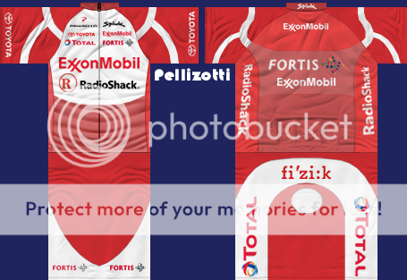
Looks really good. And for your first shirt: This work is amazing. Worth giving my first ever banana for! 
Just one tip: The Sleeves are a bit inconsistent. You have a nice design on the front with the white stripes but on the back side of the jersey (I am still talking about the sleeves) this style is missing. In my opinion, if you change that, the jersey would be perfect!
|
| |
|
|
| Ad Bot |
Posted on 02-05-2026 17:28
|
Bot Agent
Posts: Countless
Joined: 23.11.09
|
|
| IP: None |
|
|
| Pellizotti2 |
Posted on 15-07-2012 13:56
|

Grand Tour Champion

Posts: 9885
Joined: 01-05-2010
PCM$: 200.00
|
Thanks a lot, miggi. Great to hear you like it. 
Do you have any tips on how to continue a shape from the front of the jersey to the back over the shoulders like that? Or do I have to measure using the pixels?
|
| |
|
|
| Teddy The Creator |
Posted on 15-07-2012 14:00
|

Small Tour Specialist

Posts: 2107
Joined: 19-10-2011
PCM$: 200.00
|
Seriously awesome jersey Pelli. Pits a lot more experienced guys (like myself) to shame. You're clearly a natural.
|
| |
|
|
| miggi133 |
Posted on 15-07-2012 14:03
|

Classics Specialist

Posts: 2992
Joined: 19-08-2009
PCM$: 200.00
|
Well,
Usually measuring peixels is what i do. But another idea world be to add a new transparent layer and then paste a copy of the shoulder design onto it. Then you mark the space from the start of the shapes to the end of the sleeve (in length/wdth) Then copy the market area and paste it as a new layer and move the outer edge of the copy onto the outer edge of the backside. Do that with both sides and that should be it. All you have to do then, is to integrate the entinds of the design into the rest of the jersey. And I assume that I dont have to tell you that the backside of the sleeves would need a slight change of coulour, right? 
Hope this helps/works out. Otherwise: Get those Pixels Measured 
Edited by miggi133 on 15-07-2012 14:04
|
| |
|
|
| Raiko |
Posted on 15-07-2012 14:28
|

Under 23

Posts: 90
Joined: 27-10-2008
PCM$: 200.00
|
Stefansson wrote:
The Century 21 shirts are awesome Raiko! I am playing a save with Century 21 right now 
But can u please make a full set whith the leader shirts in TDF, Vuelta and Giro? That woud be great!!
And some more national shirts (a)
I'll try to do when i'll can 
|
| |
|
|
| Pellizotti2 |
Posted on 15-07-2012 14:43
|

Grand Tour Champion

Posts: 9885
Joined: 01-05-2010
PCM$: 200.00
|
Teddy The Creator wrote:
Seriously awesome jersey Pelli. Pits a lot more experienced guys (like myself) to shame. You're clearly a natural.
Wow, thanks! 
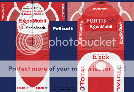
Here's v2:
|
| |
|
|
| lluuiiggii |
Posted on 15-07-2012 15:16
|
Grand Tour Champion

Posts: 8425
Joined: 30-07-2010
PCM$: 200.00
|
Looks very good Pellizotti, and when you say it's your first shirt, it's like amazing  Well the things I see you doing on the site are usually well done (stories, stages), so why not shirts? Well the things I see you doing on the site are usually well done (stories, stages), so why not shirts? 
Two things: the color of the sleeves are still not matching in the front and back  And the Fortis logo in the back of the jersey would look better in game if it had a perspective going into the top (no idea how to describe it, like this). The Exxon one will probably look fine because of it's placement closer to the center And the Fortis logo in the back of the jersey would look better in game if it had a perspective going into the top (no idea how to describe it, like this). The Exxon one will probably look fine because of it's placement closer to the center 
Lastly, about matching both sides of the sleeves: the wireframe can be useful in giving an idea where it the matching parts should be, but ultimately it's about testing in the viewer (for me at least)  The model is very irregular, and in some places the same shape is bigger when placed in the back of the sleeves then when placed in the front (again, quite hard to explain). So at least I find testing in the viewer the only way to get it matching perfectly (be it a logo, shape, etc) The model is very irregular, and in some places the same shape is bigger when placed in the back of the sleeves then when placed in the front (again, quite hard to explain). So at least I find testing in the viewer the only way to get it matching perfectly (be it a logo, shape, etc) 
|
| |
|
|
| Stefansson |
Posted on 15-07-2012 15:42
|
Amateur

Posts: 15
Joined: 18-07-2008
PCM$: 200.00
|
Raiko wrote:
Stefansson wrote:
The Century 21 shirts are awesome Raiko! I am playing a save with Century 21 right now 
But can u please make a full set whith the leader shirts in TDF, Vuelta and Giro? That woud be great!!
And some more national shirts (a)
I'll try to do when i'll can 
thx! Cant wait!!! |
| |
|
|
| miggi133 |
Posted on 15-07-2012 16:30
|

Classics Specialist

Posts: 2992
Joined: 19-08-2009
PCM$: 200.00
|
lluuiiggii wrote:
And the Fortis logo in the back of the jersey would look better in game if it had a perspective going into the top (no idea how to describe it, like this). The Exxon one will probably look fine because of it's placement closer to the center 
I would even say, that you have to rescale it a little more, because it is very wide and in game itll look like its been stratched overextensively...
|
| |
|
|
| Pellizotti2 |
Posted on 15-07-2012 16:50
|

Grand Tour Champion

Posts: 9885
Joined: 01-05-2010
PCM$: 200.00
|
Thanks again for the feedback, luigi and miggi. 
Don't know why I didn't think about that it should be the same colour on the back of the shoulders. Is there any way to copy the colour from the front to the back? Apart from filling it with the bucket fill tool, as I don't want it to be pixellated.
|
| |
|
|
| miggi133 |
Posted on 15-07-2012 18:38
|

Classics Specialist

Posts: 2992
Joined: 19-08-2009
PCM$: 200.00
|
Pellizotti2 wrote:
Thanks again for the feedback, luigi and miggi. 
Don't know why I didn't think about that it should be the same colour on the back of the shoulders. Is there any way to copy the colour from the front to the back? Apart from filling it with the bucket fill tool, as I don't want it to be pixellated.
Create a new layer, use dropper too and copy the coulour of the front part onto that layer. then follow the shape of the sleeve and then copy and paste it.
|
| |
|
|
| Pellizotti2 |
Posted on 15-07-2012 19:09
|

Grand Tour Champion

Posts: 9885
Joined: 01-05-2010
PCM$: 200.00
|
miggi133 wrote:
Pellizotti2 wrote:
Thanks again for the feedback, luigi and miggi. 
Don't know why I didn't think about that it should be the same colour on the back of the shoulders. Is there any way to copy the colour from the front to the back? Apart from filling it with the bucket fill tool, as I don't want it to be pixellated.
Create a new layer, use dropper too and copy the coulour of the front part onto that layer. then follow the shape of the sleeve and then copy and paste it.
I may be a bit stupid, but I don't quite understand. Could you explain what to do after copying the colour using the dropper tool a bit more detailed?
|
| |
|
|
| miggi133 |
Posted on 15-07-2012 19:17
|

Classics Specialist

Posts: 2992
Joined: 19-08-2009
PCM$: 200.00
|
Reading over it again, i get where it is confusing.
Let me try it again with a simpler explaination, since im guessing that your basic layer is in the darker red (the one on the shorts). If not, then just add a new layer in the same red as the shapes on the front side of the jersey (sorry sleeves). So you basically recreate the area with a new shape. So all you have to do is cut out the shape from the red layer and direct it into the right position...
Hope this was easier to understand...
*Finger Crossed*
|
| |
|
|
| Pellizotti2 |
Posted on 15-07-2012 19:23
|

Grand Tour Champion

Posts: 9885
Joined: 01-05-2010
PCM$: 200.00
|
Thanks again, miggi. 
Updated the jersey a bit more. Here's V3.

|
| |
|
|
| miggi133 |
Posted on 15-07-2012 19:30
|

Classics Specialist

Posts: 2992
Joined: 19-08-2009
PCM$: 200.00
|
Now it looks perfect.
To keep it up now, you have to get the creative juices flowing^^
Hope to see some more jerseys from you in the future!
|
| |
|
|
| Pellizotti2 |
Posted on 15-07-2012 19:47
|

Grand Tour Champion

Posts: 9885
Joined: 01-05-2010
PCM$: 200.00
|
Thanks. I'm glad. 
I really enjoyed creating that one, so I'll mix around a little bit and try to come up with a new one.
|
| |
|
|
| Pellizotti2 |
Posted on 15-07-2012 20:04
|

Grand Tour Champion

Posts: 9885
Joined: 01-05-2010
PCM$: 200.00
|
Another question. How do you create these line graphics like for example in the top right picture from your guide? The black ones.
|
| |
|
|
| lluuiiggii |
Posted on 15-07-2012 20:17
|

Grand Tour Champion

Posts: 8425
Joined: 30-07-2010
PCM$: 200.00
|
Pellizotti2 wrote:
Another question. How do you create these line graphics like for example in the top right picture from your guide? The black ones.
Well, I'm not sure if it's the same method as miggi made them, and I'm not 100% sure if it's the same for GIMP, but one way to do them (in Photoshop) would be: create the white shape (the 'inner' one) and make a duplicate of it. In the top layer of them, add the "Stroke" effect with the color black with a size of let's say 2 px, and in the lower layer, add the same stroke effect with white color and the size of 4 px.
|
| |
|
|
| miggi133 |
Posted on 15-07-2012 20:18
|

Classics Specialist

Posts: 2992
Joined: 19-08-2009
PCM$: 200.00
|
I add a new layer and then use the path tool and draw a line. the instead of using the option "mark path" i use the other option Trace path (or something like that).
In order to get it symmetrical i often only make one side and then copy it, past it and then pin it down on the original layer by clicking merge down...
|
| |
|
|
| roberpesca |
Posted on 15-07-2012 23:01
|
Under 23

Posts: 98
Joined: 05-03-2012
PCM$: 200.00
|
Century 21 is very cool |
| |
|


 And the Fortis logo in the back of the jersey would look better in game if it had a perspective going into the top (no idea how to describe it, like

