|
BIKEX Graphics | Closed
|
| Bikex |
Posted on 12-01-2013 21:38
|

Team Leader

Posts: 7418
Joined: 25-08-2012
PCM$: 600.00
|
lluuiiggii wrote:
did you by any chance use the paint bucket tool on the TdF polka dot shirt? 
Yes 
I didnt know how to change the colour of them in another way! I am using paint.net and the recolour tool only works with white background... Any tips how to do it right? |
| |
|
|
| jordynoel789 |
Posted on 13-01-2013 08:45
|

Neo-Pro

Posts: 350
Joined: 08-04-2012
PCM$: 200.00
|
i agree with luigi and i think you should put the logo on the sleves higher because in game it isn't clear to see |
| |
|
|
| lluuiiggii |
Posted on 13-01-2013 10:08
|
Grand Tour Champion

Posts: 8425
Joined: 30-07-2010
PCM$: 200.00
|
Bikex wrote:
lluuiiggii wrote:
did you by any chance use the paint bucket tool on the TdF polka dot shirt? 
Yes 
I didnt know how to change the colour of them in another way! I am using paint.net and the recolour tool only works with white background... Any tips how to do it right?
The correct would be to create your own polka dot shapes. But since there's a lot of distortions in the shape jersey and you'd basically need to distort most of them manually so they look normal in game, perhaps you can "use" the polka dot shapes of another shirt, but make sure to credit the creator of that one  What I'd try to make it less pixelated is the magic wand tool. Additionally, you could try using this jersey which has no plis so the "recoloring" would go better. What I'd try to make it less pixelated is the magic wand tool. Additionally, you could try using this jersey which has no plis so the "recoloring" would go better.
|
| |
|
|
| Bikex |
Posted on 13-01-2013 13:18
|

Team Leader

Posts: 7418
Joined: 25-08-2012
PCM$: 600.00
|
I made myself an own polkadot template, based on the tour de france mountain jersey. So its not pixelated anymore!
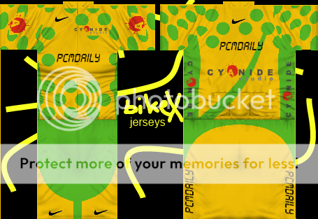 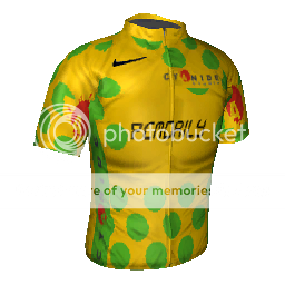 |
| |
|
|
| fernando97 |
Posted on 13-01-2013 14:04
|

Small Tour Specialist

Posts: 2123
Joined: 01-01-2012
PCM$: 200.00
|
Always improving, this version is significantly better than the other one!  |
| |
|
|
| Ad Bot |
Posted on 01-05-2026 08:21
|
Bot Agent
Posts: Countless
Joined: 23.11.09
|
|
| IP: None |
|
|
| reverendrevenant |
Posted on 13-01-2013 14:09
|
Junior Rider

Posts: 36
Joined: 29-10-2012
PCM$: 200.00
|
one of the best threads to document improvements made with every new attempt, keep it up  |
| |
|
|
| Mithrillian |
Posted on 13-01-2013 14:33
|

Domestique

Posts: 421
Joined: 05-07-2012
PCM$: 200.00
|
Bikex wrote:
I made myself an own polkadot template, based on the tour de france mountain jersey. So its not pixelated anymore!
 
Very Interesting.. Shame you didn't use the real pixel-style PCM.DAILY logo though. Your learning curve is very promising.
Your placement of the logo is abit weird, Cyanide is not really there much, it's put aside like a small sponsor. In this case though, I don't think that that is a bad thing.
Edited by Mithrillian on 13-01-2013 14:36
 ''The thing I love about PCM is that no other game requires a guide where the sentence "Acceleration does not mean acceleration" is used.''
 - cactus-jack |
| |
|
|
| Bikex |
Posted on 13-01-2013 15:51
|

Team Leader

Posts: 7418
Joined: 25-08-2012
PCM$: 600.00
|
Mithrillian wrote:
Bikex wrote:
I made myself an own polkadot template, based on the tour de france mountain jersey. So its not pixelated anymore!
 
Very Interesting.. Shame you didn't use the real pixel-style PCM.DAILY logo though. Your learning curve is very promising.
Your placement of the logo is abit weird, Cyanide is not really there much, it's put aside like a small sponsor. In this case though, I don't think that that is a bad thing.
I thought Cyanide doesn't need more space since it´s dominant on the back and on the sides
@jordynoel789 In game the logos on the sleeves are in the front so they are visible  |
| |
|
|
| Bikex |
Posted on 13-01-2013 15:53
|

Team Leader

Posts: 7418
Joined: 25-08-2012
PCM$: 600.00
|
Mithrillian wrote:
Bikex wrote:
I made myself an own polkadot template, based on the tour de france mountain jersey. So its not pixelated anymore!
 
Very Interesting.. Shame you didn't use the real pixel-style PCM.DAILY logo though.
I didnt find the logo and I couldnt determine the font but I can still change it... |
| |
|
|
| Mithrillian |
Posted on 15-01-2013 15:52
|

Domestique

Posts: 421
Joined: 05-07-2012
PCM$: 200.00
|
Bikex wrote:
Mithrillian wrote:
Bikex wrote:
I made myself an own polkadot template, based on the tour de france mountain jersey. So its not pixelated anymore!
 
Very Interesting.. Shame you didn't use the real pixel-style PCM.DAILY logo though.
I didnt find the logo and I couldnt determine the font but I can still change it...
If you want, please.
Would really like to see sone nationals for this one. What about:
BEL, GER, SPA, SVK
 ''The thing I love about PCM is that no other game requires a guide where the sentence "Acceleration does not mean acceleration" is used.''
 - cactus-jack |
| |
|
|
| Bikex |
Posted on 15-01-2013 16:20
|

Team Leader

Posts: 7418
Joined: 25-08-2012
PCM$: 600.00
|
Mithrillian wrote:
Bikex wrote:
Mithrillian wrote:
Bikex wrote:
I made myself an own polkadot template, based on the tour de france mountain jersey. So its not pixelated anymore!
 
Very Interesting.. Shame you didn't use the real pixel-style PCM.DAILY logo though.
I didnt find the logo and I couldnt determine the font but I can still change it...
If you want, please.
Would really like to see sone nationals for this one. What about:
BEL, GER, SPA, SVK
Sure I will do them, With SPA you mean Spain right?
Should I take the logo out of the header? It might be pixelated if I try so...
EDIT: Would you also like the polka dots on the NCs
Edited by Bikex on 15-01-2013 16:23
|
| |
|
|
| Mithrillian |
Posted on 15-01-2013 19:00
|

Domestique

Posts: 421
Joined: 05-07-2012
PCM$: 200.00
|
Bikex wrote:
Mithrillian wrote:
Bikex wrote:
Mithrillian wrote:
Bikex wrote:
I made myself an own polkadot template, based on the tour de france mountain jersey. So its not pixelated anymore!
 
Very Interesting.. Shame you didn't use the real pixel-style PCM.DAILY logo though.
I didnt find the logo and I couldnt determine the font but I can still change it...
If you want, please.
Would really like to see sone nationals for this one. What about:
BEL, GER, SPA, SVK
Sure I will do them, With SPA you mean Spain right?
Should I take the logo out of the header? It might be pixelated if I try so...
EDIT: Would you also like the polka dots on the NCs
SPA is wrong, my fault, it should be ESP, for Espana.
As the header logo is white/black, you could go for the more aggressive approach and use contrast to sharpen the image. Make sure you size it up in increments, and size it down to apply anti-aliasing.
As for the NC's, sure, if you find a good way to do so.
 ''The thing I love about PCM is that no other game requires a guide where the sentence "Acceleration does not mean acceleration" is used.''
 - cactus-jack |
| |
|
|
| Bikex |
Posted on 15-01-2013 21:12
|

Team Leader

Posts: 7418
Joined: 25-08-2012
PCM$: 600.00
|
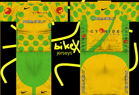
I got problems with uploading at photobucket but at least i could upload the jersey with the original PCMDaily Logo... I liked the previous one more 
 |
| |
|
|
| Bikex |
Posted on 15-01-2013 21:26
|

Team Leader

Posts: 7418
Joined: 25-08-2012
PCM$: 600.00
|
To keep the polka dots i planned all the NC Jerseys like this:
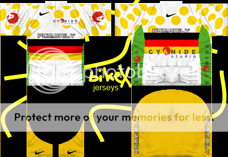
If that`s okay for you
Edited by Bikex on 15-01-2013 22:15
|
| |
|
|
| Mithrillian |
Posted on 16-01-2013 06:30
|

Domestique

Posts: 421
Joined: 05-07-2012
PCM$: 200.00
|
Nice job. Although I'm pretty sure you can sharpen daily's logo by contrasting it more.
EDIT: I got it pretty sharp at -52 (-127 max) Brightness and 70 (100 max) contrast when using the brightness/contrast tool. Maybe the original sized one can do even better
Edited by Mithrillian on 16-01-2013 06:34
 ''The thing I love about PCM is that no other game requires a guide where the sentence "Acceleration does not mean acceleration" is used.''
 - cactus-jack |
| |
|
|
| Bikex |
Posted on 16-01-2013 16:40
|

Team Leader

Posts: 7418
Joined: 25-08-2012
PCM$: 600.00
|
I thing the logo is good now I will upload the NCs later today
 |
| |
|
|
| Mithrillian |
Posted on 16-01-2013 16:51
|

Domestique

Posts: 421
Joined: 05-07-2012
PCM$: 200.00
|
Bikex wrote:
I thing the logo is good now I will upload the NCs later today

Good job! Looking forward to the nc's
 ''The thing I love about PCM is that no other game requires a guide where the sentence "Acceleration does not mean acceleration" is used.''
 - cactus-jack |
| |
|
|
| Bikex |
Posted on 16-01-2013 20:34
|

Team Leader

Posts: 7418
Joined: 25-08-2012
PCM$: 600.00
|
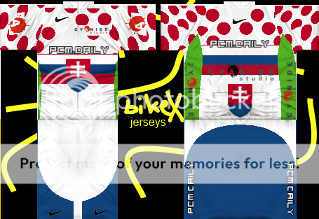
Here they are:
 Belgium Belgium
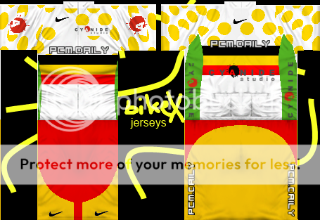
 Spain Spain
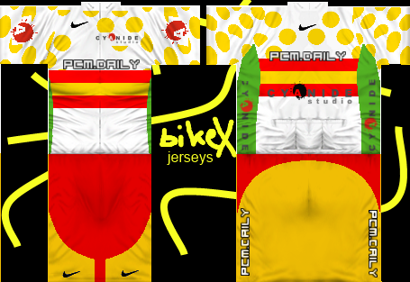
 Germany Germany
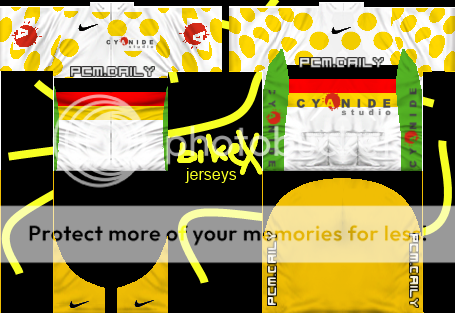
 Slovakia Slovakia
 |
| |
|
|
| ste_18 |
Posted on 16-01-2013 21:07
|
Protected Rider

Posts: 1384
Joined: 06-08-2012
PCM$: 200.00
|
Nice NC |
| |
|
|
| miggi133 |
Posted on 16-01-2013 21:24
|

Classics Specialist

Posts: 2992
Joined: 19-08-2009
PCM$: 200.00
|
Dont give up and keep practising... It aint a really good shirt in my opinion (especially the colour combination), but Im on a criticising mood lately, so dont take it all too serious. But if you keep practising, your shirts will surely improve quickly. Just something I have observed with other shirt makers when they try to force improvement, they get lazy, make shirts of verybad quality, put no effort into them or run into rookie mistakes, such as upside down logos, so always be on the outlook for that 
|
| |
|


 What I'd try to make it less pixelated is the magic wand tool. Additionally, you could try using


 Belgium
 Spain
Spain
 Germany
 Slovakia