|
JORDY'S graphics OPEN for Requests
|
| maxime86 |
Posted on 16-12-2012 19:06
|

Classics Specialist

Posts: 2941
Joined: 01-03-2012
PCM$: 200.00
|
is that the frame fo the helmet or both? or what? |
| |
|
|
| maxime86 |
Posted on 16-12-2012 19:41
|

Classics Specialist

Posts: 2941
Joined: 01-03-2012
PCM$: 200.00
|
hwo do you save it as a nif file |
| |
|
|
| jordynoel789 |
Posted on 16-12-2012 20:02
|

Neo-Pro

Posts: 350
Joined: 08-04-2012
PCM$: 200.00
|
i don't have much experience with that but i think you need nifskope or something like that ask it to miggi or jseadog |
| |
|
|
| jordynoel789 |
Posted on 16-12-2012 20:03
|

Neo-Pro

Posts: 350
Joined: 08-04-2012
PCM$: 200.00
|
that is the frame |
| |
|
|
| lluuiiggii |
Posted on 17-12-2012 00:11
|
Grand Tour Champion

Posts: 8425
Joined: 30-07-2010
PCM$: 200.00
|
That's the _d file, which should be saved as a .dds file.
And jordynoel, when posting equipment, why not post a DL link with all 4 files? The way it currently is it's not even possible to add it to the game because we don't know what model it was based on. Also I believe most people have no idea what is what on the frame, and an in-game picture would be much nicer for a presentation 
|
| |
|
|
| jordynoel789 |
Posted on 17-12-2012 11:02
|

Neo-Pro

Posts: 350
Joined: 08-04-2012
PCM$: 200.00
|
It just a preview |
| |
|
|
| jordynoel789 |
Posted on 18-12-2012 19:22
|

Neo-Pro

Posts: 350
Joined: 08-04-2012
PCM$: 200.00
|
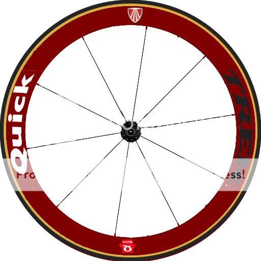
what do you think of this?  |
| |
|
|
| Ad Bot |
Posted on 30-04-2026 18:44
|
Bot Agent
Posts: Countless
Joined: 23.11.09
|
|
| IP: None |
|
|
| ThaBomb99 |
Posted on 18-12-2012 19:31
|
Junior Rider

Posts: 30
Joined: 03-05-2011
PCM$: 200.00
|
Very nice! maybe the trek letters also white? |
| |
|
|
| sutty68 |
Posted on 18-12-2012 23:23
|
Tour de France Champion

Posts: 34002
Joined: 22-08-2010
PCM$: 200.00
|
Thats a very nice looking wheel, but i agree with ThaBomb99 that trek should also be in white  |
| |
|
|
| maxime86 |
Posted on 18-12-2012 23:41
|

Classics Specialist

Posts: 2941
Joined: 01-03-2012
PCM$: 200.00
|
so will you post the links and can the trek thing be white please?
Edited by maxime86 on 19-12-2012 01:50
|
| |
|
|
| jordynoel789 |
Posted on 19-12-2012 18:03
|

Neo-Pro

Posts: 350
Joined: 08-04-2012
PCM$: 200.00
|
i 'm working on the helmet but here is the frames and the wheels
i you think something need to be different just say it oke?
https://www.mediaf...2g73055iix |
| |
|
|
| maxime86 |
Posted on 20-12-2012 14:40
|

Classics Specialist

Posts: 2941
Joined: 01-03-2012
PCM$: 200.00
|
ok thanks man |
| |
|
|
| jordynoel789 |
Posted on 26-12-2012 22:11
|

Neo-Pro

Posts: 350
Joined: 08-04-2012
PCM$: 200.00
|
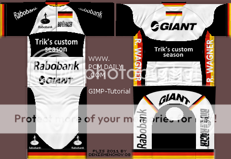
german nc

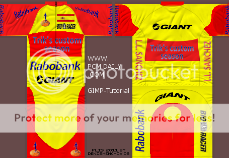
spanish nc
 |
| |
|
|
| SSJ2Luigi |
Posted on 26-12-2012 22:12
|

World Champion

Posts: 11469
Joined: 21-07-2012
PCM$: 400.00
|
they look great, excellent work
|
| |
|
|
| jordynoel789 |
Posted on 26-12-2012 22:14
|

Neo-Pro

Posts: 350
Joined: 08-04-2012
PCM$: 200.00
|
i will do the rest tomorrow
|
| |
|
|
| lluuiiggii |
Posted on 26-12-2012 22:35
|

Grand Tour Champion

Posts: 8425
Joined: 30-07-2010
PCM$: 200.00
|
Why do you not base the NCs on the original shirt? I've seen that all logos comparing the Germany and Spain NC either change on size/quality, so it looks like you "built" the jersey 2 times.. the point of "it's easy to create NCs for the shirtmaker who created it" is that he already have all the logos/shapes in position, and thus only needs to replace the base of the shirt with the NC template and recolor logos/shapes.
|
| |
|
|
| sutty68 |
Posted on 26-12-2012 22:35
|

Tour de France Champion

Posts: 34002
Joined: 22-08-2010
PCM$: 200.00
|
NC shirts look really nice  |
| |
|
|
| Mithrillian |
Posted on 26-12-2012 22:46
|

Domestique

Posts: 421
Joined: 05-07-2012
PCM$: 200.00
|
Nice job on the national jerseys. Looks nice!
Little of advice though. Completely agree with Liugi. It maked creating national jerseys a piece of cake. Just grab the jersey base, recolour it, and done. Another thing though. I personally wouldn't put rider names on the NC jerseys. It's inconsistent with the main jersey and it might be that another spaniard in the team wins.
Aside from that, good job! |
| |
|
|
| SSJ2Luigi |
Posted on 26-12-2012 22:48
|

World Champion

Posts: 11469
Joined: 21-07-2012
PCM$: 400.00
|
lluuiiggii wrote:
Why do you not base the NCs on the original shirt? I've seen that all logos comparing the Germany and Spain NC either change on size/quality, so it looks like you "built" the jersey 2 times.. the point of "it's easy to create NCs for the shirtmaker who created it" is that he already have all the logos/shapes in position, and thus only needs to replace the base of the shirt with the NC template and recolor logos/shapes.
I kinda like that it is differant from each other (and the original for that matter) it gives the feeling that it isn't just a simple re-color for the original jersey
|
| |
|
|
| Mithrillian |
Posted on 26-12-2012 22:51
|

Domestique

Posts: 421
Joined: 05-07-2012
PCM$: 200.00
|
SSJ2Luigi wrote:
lluuiiggii wrote:
Why do you not base the NCs on the original shirt? I've seen that all logos comparing the Germany and Spain NC either change on size/quality, so it looks like you "built" the jersey 2 times.. the point of "it's easy to create NCs for the shirtmaker who created it" is that he already have all the logos/shapes in position, and thus only needs to replace the base of the shirt with the NC template and recolor logos/shapes.
I kinda like that it is differant from each other (and the original for that matter) it gives the feeling that it isn't just a simple re-color for the original jersey
I'd agree if the design were different. In this case it feels, to me, like he tried to make them the same but didn't manage to. |
| |
|


