|
Jaywol's Leader Jerseys
|
| Jaywol |
Posted on 22-09-2012 20:25
|
Domestique

Posts: 722
Joined: 02-08-2008
PCM$: 200.00
|
Hi. Finally got round to attempting some jerseys. As leader jerseys are fairly straight forward I decided to start there
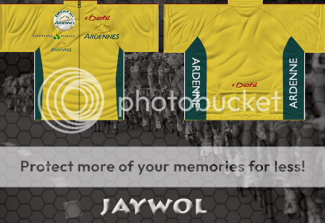
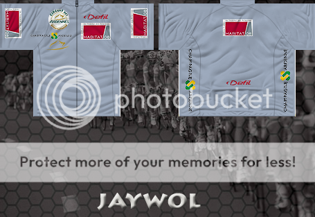
Circuit des Ardennes International
https://www.mediafire.com/?cvrzyzfb62i...zfb62i8v4y
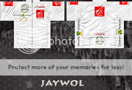
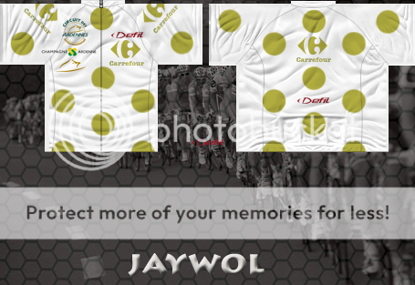
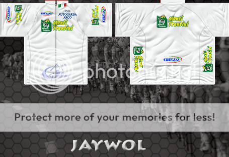
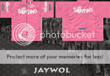
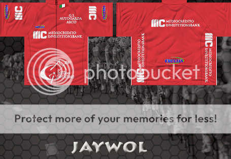
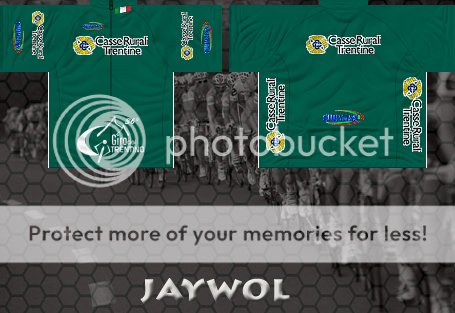
Giro del Trentino
https://www.mediafire.com/?1sgm3m0iqmo...m0iqmo33mg
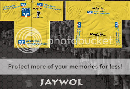
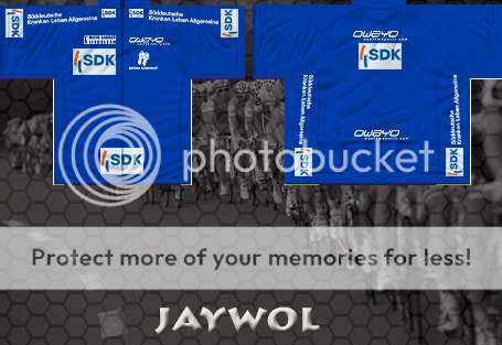
Bayern Rundfahrt
https://www.mediafire.com/?riq503qh1ic...3qh1ic98pn
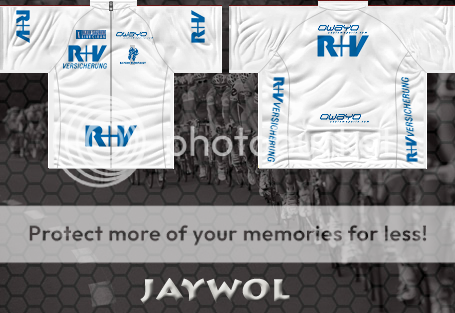
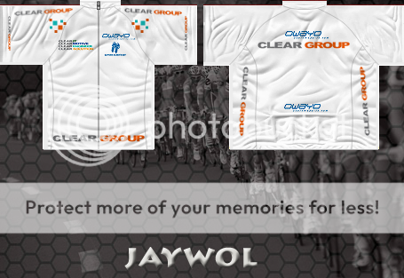
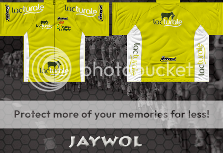
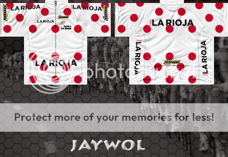
Vuelta Rioja
https://www.mediafire.com/?zd22hdceuyg...dceuyg57cy
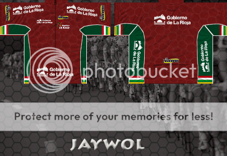
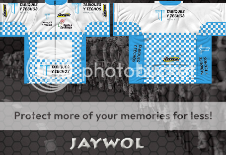
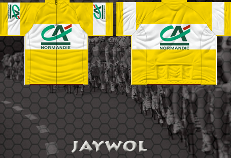
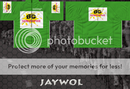
Tour of Normandy
https://www.mediafire.com/?jx16gpo0hsh...po0hshdnfk
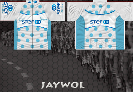
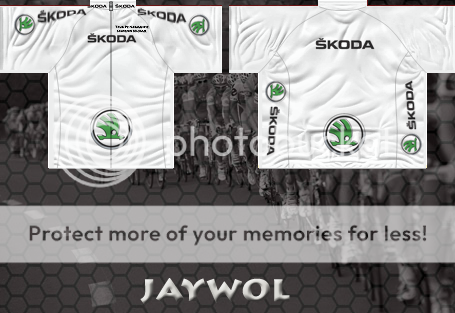
Tour Bretagne
https://www.mediaf...ds2bw78qw1
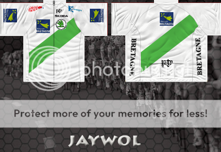
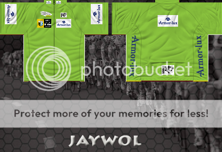
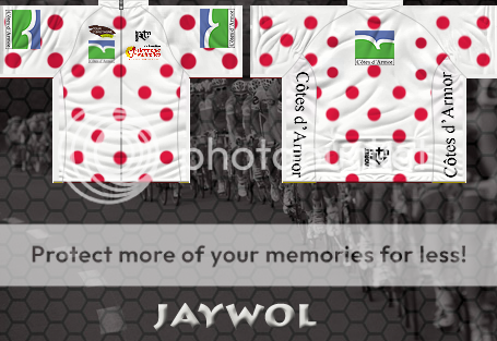
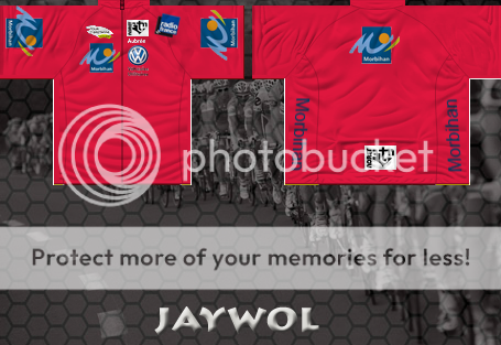
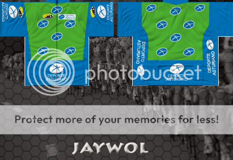
Vuelta Aturias
https://www.mediafire.com/?ss9tdc3849f...c3849fr0lr
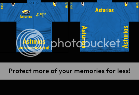
This jersey was created by truxako, but I have included it in the pack.
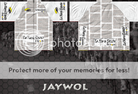
Not an exact replica, I have left the shoulders blank to avoid the distortion which occurs in game.
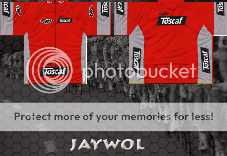
This jersey is named 'regularidad' on the official website, which translates to regularity ? However I have used this as the young riders jersey.
Tour De Serbie
https://www.mediafire.com/?f3a5321v06k...21v06kqtsu
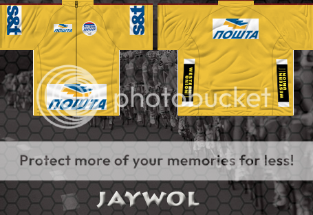
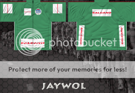
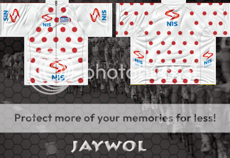
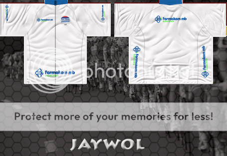
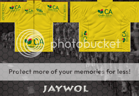
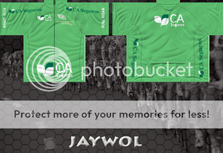
Volta ao Alentejo
https://www.mediafire.com/download.php...ooqafkouie
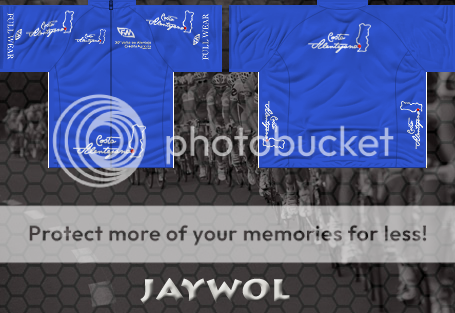
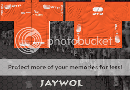
Vuelta Ciclistica Leon
https://www.mediafire.com/?n056p1uc9xw...1uc9xw7uyj
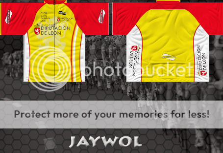
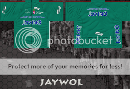
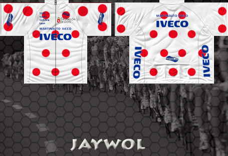
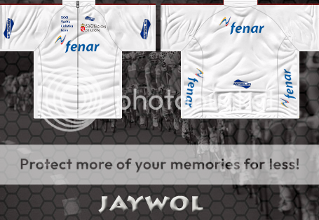
Edited by Jaywol on 22-12-2012 16:12
|
| |
|
|
| lluuiiggii |
Posted on 23-09-2012 00:02
|
Grand Tour Champion

Posts: 8425
Joined: 30-07-2010
PCM$: 200.00
|
For your first shirts, nice job  Indeed it's probably easier to start with leader ones Indeed it's probably easier to start with leader ones 
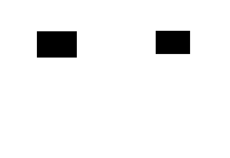
As for the shirts: first, don't forget that above the shirts the transfers will be placed, so you can't place sponsors in that area  (I mean, you can, but they won't appear in the game (I mean, you can, but they won't appear in the game  ) All jerseys have got sponsors in the 'area', specially the young and mountain ones. I've attached a file which shows the exact placement of transferts in game ) All jerseys have got sponsors in the 'area', specially the young and mountain ones. I've attached a file which shows the exact placement of transferts in game  (it's a 455x313 px .png, so just open it in Photoshop/GIMP/whatever and paste it above the shirt for reference). (it's a 455x313 px .png, so just open it in Photoshop/GIMP/whatever and paste it above the shirt for reference).
Secondly, the sponsors in the front should be smaller than what they currently are. You should try to fit them inside the 'stitchings' separating the chest from the arms - look in other jerseys (leader ones are good examples) or in this template. Additionally, the sponsors on the sides of the shirt will appear upside down 
Lastly, the logos seem to lose quality as the shirts go by? On the mountain shirt all logos are fine and look good quality wise. Then in the young shirt they've lost some quality, and on the other two they seem to lose even more quality. Lastly, on the young shirt, the Caisse logo near the neck, on the back of the shirt, should be much smaller (that region is quite big in game), and I haven't really checked but perhaps the sleeves one should be smaller as well.
But as said, for a first try it's good. Keep it up and with time and experience you'll certainly only get better 
Edited by lluuiiggii on 23-09-2012 00:02
|
| |
|
|
| sutty68 |
Posted on 23-09-2012 00:06
|
Tour de France Champion

Posts: 34002
Joined: 22-08-2010
PCM$: 200.00
|
Jaywol - Nice work mate, really like them  |
| |
|
|
| Jaywol |
Posted on 24-09-2012 10:32
|

Domestique

Posts: 722
Joined: 02-08-2008
PCM$: 200.00
|
Thx for the positve feedback guys. Thx also for the tips, I will try and tweek the jerseys I've already made. For some unknown and extremely frustrating reason I can't add graphical files to my posts. lluuiiggii, if you would like to add previews of the shirts, I would be grateful.
Vuelta la Rioja, Castilla y Leon & Bayern Rundfahrt are next in the pipeline. |
| |
|
|
| Ad Bot |
Posted on 30-04-2026 04:59
|
Bot Agent
Posts: Countless
Joined: 23.11.09
|
|
| IP: None |
|
|
| KirillW |
Posted on 24-09-2012 16:05
|
Junior Rider

Posts: 35
Joined: 17-05-2012
PCM$: 200.00
|
Could you upload an example of each pack so people know what their download? Would be nice! |
| |
|
|
| lluuiiggii |
Posted on 24-09-2012 16:54
|

Grand Tour Champion

Posts: 8425
Joined: 30-07-2010
PCM$: 200.00
|
Jaywol wrote:
For some unknown and extremely frustrating reason I can't add graphical files to my posts.
Can't you upload them to imageshack or photobucket or some other image host site and then use the [img] tags to post directly in the post?
|
| |
|
|
| rogvi97 |
Posted on 24-09-2012 17:15
|
Breakaway Specialist

Posts: 923
Joined: 10-07-2012
PCM$: 200.00
|
Awesome shirts! Already downloaded and in game 
No signature available
|
| |
|
|
| lluuiiggii |
Posted on 24-09-2012 17:31
|

Grand Tour Champion

Posts: 8425
Joined: 30-07-2010
PCM$: 200.00
|
Btw, just seen Trentino in the first post - they've already been made by Jomo  (attached) (attached)
But well, since you've already made them, you can compare your and Jomo's shirts, certainly a way to improve by looking at what he has done differently than you  Oh and again take care with the transferts placement Oh and again take care with the transferts placement 
|
| |
|
|
| Jaywol |
Posted on 24-09-2012 23:08
|

Domestique

Posts: 722
Joined: 02-08-2008
PCM$: 200.00
|
Hey nice jersey's Jomo, you've set a high benchmark there. Two questions though ? How do you curve the logo's and how do you get them to overlap from the front of the jersey to the back as in the side panels ?
I still havn't quite figured out how the shoulders work yet either.
Edited by Jaywol on 24-09-2012 23:11
|
| |
|
|
| lluuiiggii |
Posted on 24-09-2012 23:34
|

Grand Tour Champion

Posts: 8425
Joined: 30-07-2010
PCM$: 200.00
|
Hardly think jomo will read your post here, he only has 4 posts in Daily. You should try Cya's forum 
Anyway I'm not jomo but I could try to help a bit  For curving the logos, it depends on the program you're using. If on Photoshop, you can do it with Ctrl + T -> Warp, although I feel it's the one that has the more quality lost. If you have CS5 I think, you can use the Puppet Warp or something like that tool, which does a good also. I use the preset Warp, mostly the "rise" one (can be used for both shoulders and sides and keeps the logo in a nice quality). For curving the logos, it depends on the program you're using. If on Photoshop, you can do it with Ctrl + T -> Warp, although I feel it's the one that has the more quality lost. If you have CS5 I think, you can use the Puppet Warp or something like that tool, which does a good also. I use the preset Warp, mostly the "rise" one (can be used for both shoulders and sides and keeps the logo in a nice quality).
I'm not sure I get the second question, but you mean like having one part of the logo in the back of the shirt for example and the other in the front? If yes, you could make a copy of the layer and move it to the front/back, then testing in the Cyclist Viewer until it looks good.
As for the shoulders, basically they should get smaller as they go towards the neck and upper as well. No way to explain it better than the template image (and as I've already said, I've found the rise effect to be pretty useful for the shoulders) 
Edited by lluuiiggii on 24-09-2012 23:34
|
| |
|
|
| Jaywol |
Posted on 25-09-2012 09:27
|

Domestique

Posts: 722
Joined: 02-08-2008
PCM$: 200.00
|
Hi lluuiiggii. I've found the warp utility. I'm using photoshop CS3. What are the pre-set settings you use ? Also, where do I find the rise tool ? |
| |
|
|
| anderspcm |
Posted on 25-09-2012 10:24
|

Sprinter

Posts: 1707
Joined: 09-01-2010
PCM$: 200.00
|
You can find the rise tool, when you use warp tool. In the top of the screen, almost on the left side, there is a box, where I can't remember what it says, but if you click on the tap, there should show up a dropdown menu, where you can find the rise & fish tool.
|
| |
|
|
| Jaywol |
Posted on 25-09-2012 22:44
|

Domestique

Posts: 722
Joined: 02-08-2008
PCM$: 200.00
|
lluuiiggii the template you've attached is two black rectangles ? Not sure if its a problem with my browser, hence the issue with adding graphics files to my posts
anderspcm thanks for the tips, have found the rise tool in the warp sub menu, but thought the perspective tool might work a bit better for logo's on the shoulders ?
Thx for the tips and feedback. |
| |
|
|
| lluuiiggii |
Posted on 25-09-2012 23:05
|

Grand Tour Champion

Posts: 8425
Joined: 30-07-2010
PCM$: 200.00
|
Jaywol wrote:
lluuiiggii the template you've attached is two black rectangles ? Not sure if its a problem with my browser, hence the issue with adding graphics files to my posts
anderspcm thanks for the tips, have found the rise tool in the warp sub menu, but thought the perspective tool might work a bit better for logo's on the shoulders ?
Thx for the tips and feedback.
The template is what I've linked twice now 

|
| |
|
|
| anderspcm |
Posted on 26-09-2012 06:02
|

Sprinter

Posts: 1707
Joined: 09-01-2010
PCM$: 200.00
|
Jaywol wrote:
lluuiiggii the template you've attached is two black rectangles ? Not sure if its a problem with my browser, hence the issue with adding graphics files to my posts
anderspcm thanks for the tips, have found the rise tool in the warp sub menu, but thought the perspective tool might work a bit better for logo's on the shoulders ?
Thx for the tips and feedback. You can use it, if it is to difficult to use fish and rise tool, but rish and rise tool is much better, you just have to add two lines under and over the logos when you are using fish tool, because that the fish tool, makes two bens and you will only need one of the ends.
|
| |
|
|
| Jaywol |
Posted on 26-09-2012 18:15
|

Domestique

Posts: 722
Joined: 02-08-2008
PCM$: 200.00
|
anderspcm thanks I will keep playing around with it some more. lluuiiggii thx also, I already have that template or similar from the shirts tutorial from the same forum. Working on Bayern Rundfahrt at the minute, will post as soon as I have something. |
| |
|
|
| Jaywol |
Posted on 02-10-2012 22:10
|

Domestique

Posts: 722
Joined: 02-08-2008
PCM$: 200.00
|
Bayern Rundfahrt added. |
| |
|
|
| lluuiiggii |
Posted on 02-10-2012 23:47
|

Grand Tour Champion

Posts: 8425
Joined: 30-07-2010
PCM$: 200.00
|
They look nice, good job!  However, in all shirts except for the overall leader one, one of the side sponsors is wrong (will appear upside down) However, in all shirts except for the overall leader one, one of the side sponsors is wrong (will appear upside down)  Additionally, I think the front logos should still be smaller. And on a particular note, the "V" part of the logo in the shoulder of the overall leader one should probably be much smaller (I haven't tested it in game but that 'region' of the shirt is really bigger in the model compared to the .tga file, it really distorts the logos). Additionally, I think the front logos should still be smaller. And on a particular note, the "V" part of the logo in the shoulder of the overall leader one should probably be much smaller (I haven't tested it in game but that 'region' of the shirt is really bigger in the model compared to the .tga file, it really distorts the logos).
Btw, there were some Bayern Rundfahrt leader shirts made, but they were still in the PCM08-10 style. Nevertheless, I thought it could be useful to attach them, since some things haven't changed and can be compared, more specifically the front sponsor logos  
|
| |
|
|
| jseadog1 |
Posted on 02-10-2012 23:49
|

Grand Tour Champion

Posts: 9141
Joined: 18-07-2010
PCM$: 19152.00
|
I really like the job that has been done so far! Keep it up 
PCM.Daily Survivor Season 2 Fan Favorite Winner
PCM.Daily NFL Fantasy Football Champion: 2012
PCM.Daily NHL Prediction Game Champion: 2013
PCM.Daily NFL Prediction Game Champion:
2012, 2013, 2015, 2016, 2021, 2024, 2025
|
| |
|
|
| Jaywol |
Posted on 03-10-2012 22:15
|

Domestique

Posts: 722
Joined: 02-08-2008
PCM$: 200.00
|
Hi. For Bayern Rundfahrt the leader jersey was a bit of a nightmare. The logo's are about as small as I could go without too much distortion and yes they look overly large in game. I only noticed the side panels were upside down as I got too the last jersey. I will tweak the jerseys finished so far and re-post before I begin the next batch. |
| |
|


 Indeed it's probably easier to start with leader ones
 ) All jerseys have got sponsors in the 'area', specially the young and mountain ones. I've attached a file which shows the exact placement of transferts in game