|
2013 Jerseys
|
| lluuiiggii |
Posted on 17-01-2013 01:25
|
Grand Tour Champion

Posts: 8425
Joined: 30-07-2010
PCM$: 200.00
|
miggi133 wrote:
That Name rings a bell... Didnt I make a Sao jose dos Campos jersey for you years back?
Yes. That was for the Elite-2 team that followed the 2010 Pro Continental team's (Scott-Marcondes-São José dos Campos) bankrupcy  Coincindentally (or not really), Marcondes Cesar is also one of the main sponsors for the Funvic team.
|
| |
|
|
| Pellizotti2 |
Posted on 17-01-2013 06:30
|
Grand Tour Champion

Posts: 9885
Joined: 01-05-2010
PCM$: 200.00
|
Found this on Cyanide:

|
| |
|
|
| Maximka |
Posted on 17-01-2013 07:00
|

Sprinter

Posts: 1889
Joined: 22-10-2007
PCM$: 200.00
|
Pellizotti2 wrote:
Found this on Cyanide:

That is very nice one!
|
| |
|
|
| Schleck96 |
Posted on 17-01-2013 09:18
|

Protected Rider

Posts: 1410
Joined: 10-08-2010
PCM$: 200.00
|
Cool shirt. Better than some of the WorldTour jerseys to be honest
|
| |
|
|
| sutty68 |
Posted on 17-01-2013 10:00
|
Tour de France Champion

Posts: 34002
Joined: 22-08-2010
PCM$: 200.00
|
Thats a really nice version 
|
| |
|
|
| rapace85 |
Posted on 17-01-2013 11:55
|
Stagiare

Posts: 157
Joined: 26-05-2009
PCM$: 200.00
|
yep, but it's the same HTC desgin for 2011

|
| |
|
|
| Ad Bot |
Posted on 30-04-2026 04:27
|
Bot Agent
Posts: Countless
Joined: 23.11.09
|
|
| IP: None |
|
|
| Maximka |
Posted on 17-01-2013 13:56
|

Sprinter

Posts: 1889
Joined: 22-10-2007
PCM$: 200.00
|
So? That was another one good-looking jersey
|
| |
|
|
| rapace85 |
Posted on 17-01-2013 15:50
|
Stagiare

Posts: 157
Joined: 26-05-2009
PCM$: 200.00
|
Maximka wrote:
So? That was another one good-looking jersey
of course, but it's a plagiarism!
|
| |
|
|
| Brahama |
Posted on 17-01-2013 16:02
|
Stagiare

Posts: 227
Joined: 05-12-2009
PCM$: 200.00
|
Here's the shirt + bike + the Portugese champ.

 R.I.P Wouter Weylandt (1984 - 2011)
Pain is a big fat creature riding on your back. The farther you pedal, the heavier he feels. The harder you push, the tighter he squeezes your chest. The steeper the climb, the deeper he digs his jagged, sharp claws into your muscles.
R.I.P Wouter Weylandt (1984 - 2011)
Pain is a big fat creature riding on your back. The farther you pedal, the heavier he feels. The harder you push, the tighter he squeezes your chest. The steeper the climb, the deeper he digs his jagged, sharp claws into your muscles.- Scott Martin |
| |
|
|
| Brahama |
Posted on 17-01-2013 16:14
|

Stagiare

Posts: 227
Joined: 05-12-2009
PCM$: 200.00
|
AVIA - Crabbé:

And EFC - Omega-Pharma - QuickStep:

Edited by Brahama on 17-01-2013 16:17
 R.I.P Wouter Weylandt (1984 - 2011)
Pain is a big fat creature riding on your back. The farther you pedal, the heavier he feels. The harder you push, the tighter he squeezes your chest. The steeper the climb, the deeper he digs his jagged, sharp claws into your muscles.
R.I.P Wouter Weylandt (1984 - 2011)
Pain is a big fat creature riding on your back. The farther you pedal, the heavier he feels. The harder you push, the tighter he squeezes your chest. The steeper the climb, the deeper he digs his jagged, sharp claws into your muscles.- Scott Martin |
| |
|
|
| mede33 |
Posted on 17-01-2013 17:04
|

Protected Rider

Posts: 1192
Joined: 21-03-2012
PCM$: 200.00
|
I hope Will007 will do those two jerseys, because it will be so easy for him as he already done the OPQS jersey !
|
| |
|
|
| davidian |
Posted on 17-01-2013 17:28
|
Junior Rider

Posts: 38
Joined: 18-10-2012
PCM$: 200.00
|
Another one which is similar : Etixx - iHNed CT, OPQS development team

|
| |
|
|
| tovhol |
Posted on 17-01-2013 18:34
|
Breakaway Specialist

Posts: 775
Joined: 06-05-2011
PCM$: 200.00
|
Edited by tovhol on 17-01-2013 18:35
|
| |
|
|
| krisa |
Posted on 17-01-2013 19:06
|

Classics Specialist

Posts: 3892
Joined: 12-04-2011
PCM$: 200.00
|
nice one tovhol
|
| |
|
|
| miggi133 |
Posted on 17-01-2013 23:08
|

Classics Specialist

Posts: 2992
Joined: 19-08-2009
PCM$: 200.00
|
|
| |
|
|
| fcancellara |
Posted on 17-01-2013 23:14
|

Grand Tour Specialist

Posts: 4813
Joined: 18-08-2011
PCM$: 200.00
|
Quality!
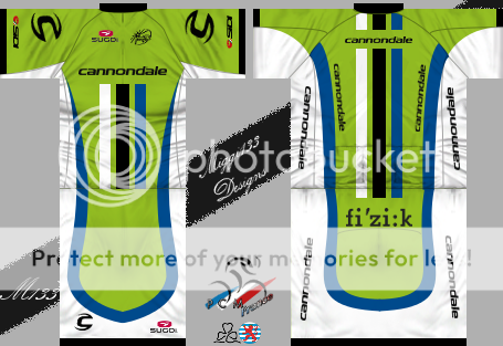
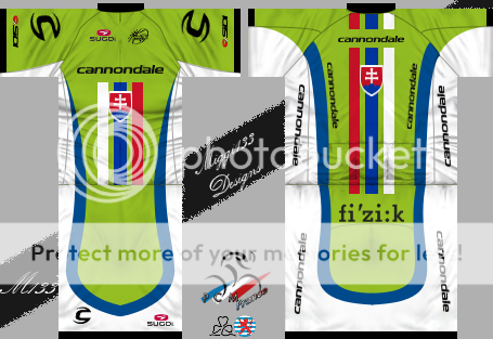
UCI logo is very unclear though, and are you sure about that green, shouldn't it be a little brighter?
|
| |
|
|
| miggi133 |
Posted on 17-01-2013 23:25
|

Classics Specialist

Posts: 2992
Joined: 19-08-2009
PCM$: 200.00
|
fcancellara wrote:
Quality!
UCI logo is very unclear though, and are you sure about that green, shouldn't it be a little brighter?
Well, the quality loss of the UCI logo comes from the rescaling... As for the green, I took the one from the cannondale Logo on the english wikipedia site...
|
| |
|
|
| lluuiiggii |
Posted on 17-01-2013 23:28
|

Grand Tour Champion

Posts: 8425
Joined: 30-07-2010
PCM$: 200.00
|
Nice job! Two things though: it looks to me that the white and blue stripes are a bit smaller (in width) than the black one. Also, concerning the back stripes, they look better in game when they're also applied a 'perspective' effect ( Daniano's shirt is the only one to have done that so far  )
|
| |
|
|
| sutty68 |
Posted on 17-01-2013 23:33
|

Tour de France Champion

Posts: 34002
Joined: 22-08-2010
PCM$: 200.00
|
The Sky Norway shirt is very nice 
|
| |
|
|
| usto |
Posted on 18-01-2013 10:45
|

Stagiare

Posts: 212
Joined: 23-06-2009
PCM$: 200.00
|
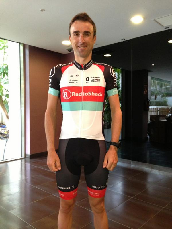
Radioshack jersey:

|
| |
|


 Coincindentally (or not really), Marcondes Cesar is also one of the main sponsors for the Funvic team.


