PCM.daily banner
21-11-2024 09:54
PCM.daily
Users Online
· Guests Online: 40

· Members Online: 1
Ollfardh

· Total Members: 161,769
· Newest Member: Losiuda
View Photo
Photo Albums > PCM09: Official Screenshots > The P First photo Previous Photo Next Photo Last photo
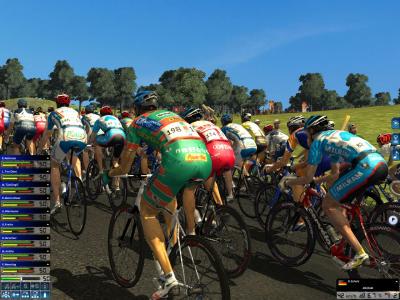
The P
Peloton with a Milram guy in the picture

Date: 13-02-2009
Added by: CrueTrue
Dimensions: 1280 x 960 pixels
Filesize: 264.7kB
Comments: 16
Rating: *****
Number of views: 9539
Comments
#1 | alexkr00 on 13. February 2009 15:59
at least I see one texture per riderPfft and probably new energy levels sistemWink
#2 | Inferio on 13. February 2009 17:40
Difference between 07 and 08 was much bigger than difference between 08 and 09...And I tnihk, tahat the energy levels system is the same as in last editiom...

But the news presented in the text on official web of Cyanide sounds very good...
#3 | Maximka on 14. February 2009 10:40
Oh no, only two different manufactures for all the teams again! Sucks!
#4 | krzychu92 on 14. February 2009 11:17
OMG I see Tinkoff shirt...
#5 | Wiggo on 14. February 2009 12:12
It's just an early screen.
#6 | Deadpool on 16. February 2009 18:00
Yeah, from the interview with the Cyanide CEO it appears that 09 will not be that much of a jump, but '10 will be
#7 | ZIRH on 17. February 2009 16:51
they really need to add more bikes and stuff!
#8 | Halvor on 19. February 2009 10:28
Wow look at the Milram jersey... Pfft The shorts.
#9 | Billy Boy on 23. February 2009 15:59
Nice with team socks and shoes, though not good that the milram rider is using Saunier duval socks and shoes Smile
#10 | doddy13 on 03. March 2009 21:19
i see a KOM banner at the top of the climb.
#11 | SotD on 04. March 2009 11:24
Not much change unfortunately... Hopefully the gameplay will make up for it...
#12 | Guido Mukk on 08. March 2009 17:09
Numbers great..need to add daily frames and helmets.. Conclusion..I will buy this game even this year
#13 | lagetcher on 08. March 2009 20:10
Just a small thing, but I wonder why the camera angle, race speed and music icons were moved downwards. I would have thought they are more in the way of the action; in the top right corner they are less prominent. Having said that it makes hardly any difference.
#14 | doddy13 on 31. March 2009 22:54
your right to say that. I agree
#15 | Polkadott on 16. May 2009 13:05
Nice Shot
#16 | borisdehaes on 05. February 2011 17:23
haha, you can even see the 'vermarc' sign on the milram shorts. strange to think it's only 500 meters from my home Smile
Post Comment
Please Login to Post a Comment.
Ratings
Rating is available to Members only.

Please login or register to vote.

Awesome! Awesome! 100% [4 Votes]
Very Good Very Good 0% [No Votes]
Good Good 0% [No Votes]
Average Average 0% [No Votes]
Poor Poor 0% [No Votes]
Login
Username

Password


Not a member yet?
Click here to register.

Forgotten your password?
Request a new one here.
Latest content
Screenshots
Stage 12, Tour de France 2012
PCM09: Funny Screenshots
Fantasy Betting
Current bets:
No bets available.
Best gamblers:
bullet fighti... 18,376 PCM$
bullet df_Trek 17,374 PCM$
bullet Marcovdw 15,345 PCM$
bullet jseadog1 13,552 PCM$
bullet baseba... 10,439 PCM$

bullet Main Fantasy Betting page
bullet Rankings: Top 100
ManGame Betting
Current bets:
No bets available.
Best gamblers:
bullet Ollfardh 21,890 PCM$
bullet df_Trek 15,520 PCM$
bullet Marcovdw 14,800 PCM$
bullet jseadog1 13,500 PCM$
bullet baseball... 7,332 PCM$

bullet Main MG Betting page
bullet Get weekly MG PCM$
bullet Rankings: Top 100
Render time: 0.39 seconds