|
Graphics by the_hoyle | Requests OPEN
|
| nacho63 |
Posted on 02-04-2015 17:38
|

Sprinter

Posts: 1918
Joined: 14-03-2013
PCM$: 200.00
|
MG Userbar
Team name: Gatorade - SIS
Jersey: https://pbs.twimg...00x400.png
A userbar to go into my signature would be great  |
| |
|
|
| the_hoyle |
Posted on 02-04-2015 23:43
|

Grand Tour Champion

Posts: 7592
Joined: 28-05-2009
PCM$: 300.00
|
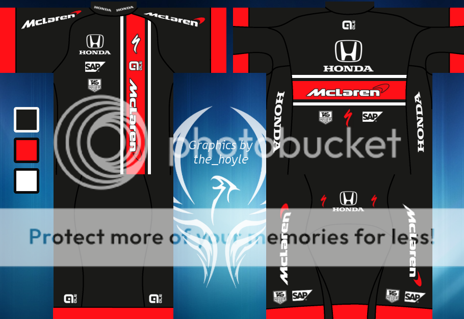
Had a very productive night, so managed to work a lot on the McLaren-Honda jersey. Even to the point where I am happy to release the initial jersey!
Credit to Paul23 for the suggestion on the sponsor
.: Manager of :.
 .: My Awards :.


 |
| |
|
|
| TheManxMissile |
Posted on 02-04-2015 23:56
|

Tour de France Champion

Posts: 17881
Joined: 12-05-2012
PCM$: 0.00
|
Being honest, i don't like it. A mix of things combining to make me dislike it that i shall now list! Please feel free to ignore me or rage-quit the site 
Too many lines/seams - Breaks the flow up too much and causes,,,
Jaring contrast - Of colors and shapes. There's a lot of individual things happening and sharp cuts between colors but not in a good way.
Color scheme - McLaren kit should never be black. Silver/grey please! The way the black main, silver seams and red interact is too dominating.... or just wrong to my modern mclaren eyes
Pixelation - Ok i'm being quite pedantic on this one and it's not helped by the color scheme but the seams really seem pixelated, or unclear like when you see a small chequered shirt on tv and it shimmers around. Unless the seams are designed like a twist which would explain it but be a super weird design choice...
But apart from that i like it 
I need to stop being depressing....
|
| |
|
|
| Scattershot Will |
Posted on 03-04-2015 00:07
|

Domestique

Posts: 479
Joined: 14-07-2014
PCM$: 200.00
|
i really like it
Bob Jungels- LEGEND
JUNGELSFAN |
| |
|
|
| Paul23 |
Posted on 03-04-2015 00:18
|

Grand Tour Specialist

Posts: 4394
Joined: 10-08-2011
PCM$: 400.00
|
Its awesome! I love it! You made great work, imo even your best work so far(warning: opinion) Just leaders jerseys, NCs and you could release a pack.
|
| |
|
|
| sgdanny |
Posted on 03-04-2015 00:19
|

Classics Specialist

Posts: 3587
Joined: 18-03-2014
PCM$: 200.00
|
A black McLaren shirt is the only bad thing I can say, other than that great work 
|
| |
|
|
| Ad Bot |
Posted on 02-05-2026 04:58
|
Bot Agent
Posts: Countless
Joined: 23.11.09
|
|
| IP: None |
|
|
| sutty68 |
Posted on 03-04-2015 00:55
|
Tour de France Champion

Posts: 34002
Joined: 22-08-2010
PCM$: 200.00
|
Either you like it or you don't but for me personally i think its Great  |
| |
|
|
| murao22 |
Posted on 03-04-2015 09:03
|

Protected Rider

Posts: 1047
Joined: 31-03-2013
PCM$: 500.00
|
Awesome, I love it! |
| |
|
|
| the_hoyle |
Posted on 03-04-2015 10:42
|

Grand Tour Champion

Posts: 7592
Joined: 28-05-2009
PCM$: 300.00
|
@all: Thanks for the feedback! Seems that it has split opinion... 
@TMM: You make a valid point on all of those things you mention. You will see no ignoring/refusal to go back to improve/rage quitting here! I think the pixelation does come from the extreme contrast between the black jersey and the white seams. Looking at it now, the white seams doesn't work. Last night (after working on it for 4/5 hours straight) the white looked ok. Going for the dark colours on the seams would be much better.
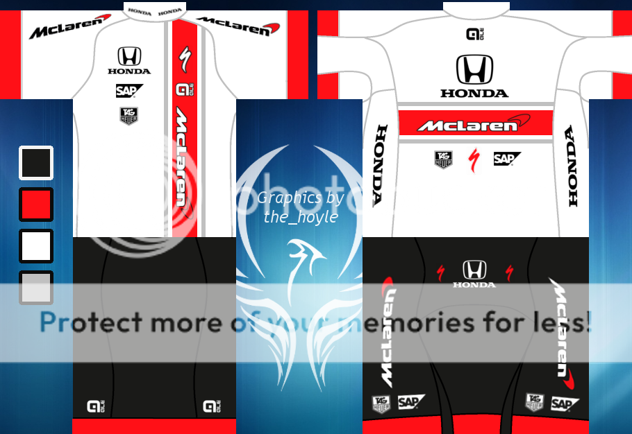
@TMM & sgdanny: I agree that McLaren colours needs to be white/silver with red, but I thought I would go for a darker alternative. I think I have done something to amend that 
.: Manager of :.
 .: My Awards :.


 |
| |
|
|
| the_hoyle |
Posted on 03-04-2015 10:50
|

Grand Tour Champion

Posts: 7592
Joined: 28-05-2009
PCM$: 300.00
|
Given the feedback from TMM and sgdanny, I have gone back and made a few amendment to the McLaren-Honda jersey.
Here is V1, with the white seams changed to a darker colour:
And this is V2, changing the jersey to the more traditional McLaren colours.
The black shorts remain on V2, due to my own personal perference and also following Rule #14 of the Velominati 
.: Manager of :.
 .: My Awards :.


 |
| |
|
|
| Paul23 |
Posted on 03-04-2015 10:50
|

Grand Tour Specialist

Posts: 4394
Joined: 10-08-2011
PCM$: 400.00
|
I think, the black is alright, because f.e. the WC jersey would be white. So there's a bit of contrast there. I don't know how silver/grey would look like...
Also, I think(if you plan to make NCs and WCs) it would be cool, if you would put the stripes where the dark orange/redish color is. so not just simply stripes all around the jersey. Maybe someone is able to create equipment for that. If not, I will try to create a frame(at least)
|
| |
|
|
| the_hoyle |
Posted on 03-04-2015 10:56
|

Grand Tour Champion

Posts: 7592
Joined: 28-05-2009
PCM$: 300.00
|
@Paul: Yeah, the design does lead to some nice possible NCs, that will be different from the norm if I follow the same design layout. Not sure if you have seen the alternative versions, as we posted at similar times, but they are above. I think the white version works really nicely.
.: Manager of :.
 .: My Awards :.


 |
| |
|
|
| Paul23 |
Posted on 03-04-2015 11:36
|

Grand Tour Specialist

Posts: 4394
Joined: 10-08-2011
PCM$: 400.00
|
Ah, seen them now, thanks. The Black one is definately an upgrade! And the white one is nice, too. But its also kinda a polish NC xD
|
| |
|
|
| the_hoyle |
Posted on 03-04-2015 12:03
|

Grand Tour Champion

Posts: 7592
Joined: 28-05-2009
PCM$: 300.00
|
For Nacho63:
.: Manager of :.
 .: My Awards :.


 |
| |
|
|
| the_hoyle |
Posted on 03-04-2015 12:09
|

Grand Tour Champion

Posts: 7592
Joined: 28-05-2009
PCM$: 300.00
|
Jersey Request (Man Game)
gargatouf - 100% complete
Userbar Requests (Man Game)
Me (the_hoyle) - DONE
Roturn - DONE
JoeArmstrong13 - DONE
Scorchio - DONE
Nacho63 - DONE
Banner Requests (Man Game)
sgdanny - DONE
JoeArmstrong13 - DONE
Scorchio - DONE
Other Requests
McLaren-Honda Pack - 50% complete
Sky ProCycling - 0% complete
When a request is done, I will link it to the post for easy reference
.: Manager of :.
 .: My Awards :.


 |
| |
|
|
| sutty68 |
Posted on 03-04-2015 15:22
|

Tour de France Champion

Posts: 34002
Joined: 22-08-2010
PCM$: 200.00
|
I like both versions of the McLaren-Honda jersey especially V2, but have you tried the V2 version with the red and white the other way around.
Edited by sutty68 on 03-04-2015 15:22
|
| |
|
|
| the_hoyle |
Posted on 03-04-2015 22:22
|

Grand Tour Champion

Posts: 7592
Joined: 28-05-2009
PCM$: 300.00
|
@sutty: Reversing the colours on V2 doesn't look right I'm afraid. It was one of the combinations I tried
.: Manager of :.
 .: My Awards :.


 |
| |
|
|
| sutty68 |
Posted on 03-04-2015 23:06
|

Tour de France Champion

Posts: 34002
Joined: 22-08-2010
PCM$: 200.00
|
the_hoyle wrote:
@sutty: Reversing the colours on V2 doesn't look right I'm afraid. It was one of the combinations I tried
Ah ok, just thought i would suggest it |
| |
|
|
| Cycleman123 |
Posted on 04-04-2015 01:34
|

Grand Tour Specialist

Posts: 4428
Joined: 30-07-2012
PCM$: 200.00
|
Hey mate,
When you have the time, could you please re-size the two banners you made for me in my sig to be probably have the size or a bit smaller? Thanks a lot 
On another note, I'm really liking the recent work. Regarding the McLaren jersey I personally prefer the white version 
Edited by Cycleman123 on 04-04-2015 01:36
|
| |
|
|
| the_hoyle |
Posted on 04-04-2015 19:13
|

Grand Tour Champion

Posts: 7592
Joined: 28-05-2009
PCM$: 300.00
|
@cycleman: A smaller Orica banner was made for you when I did the other one. Find it below  The Road to Le Tour will take a little longer, as I will have to start from scratch with it. The Road to Le Tour will take a little longer, as I will have to start from scratch with it.
.: Manager of :.
 .: My Awards :.


 |
| |
|


