|
2014 Jerseys
|
| kyle |
Posted on 15-01-2014 15:00
|

Neo-Pro

Posts: 311
Joined: 15-07-2011
PCM$: 200.00
|
anderspcm wrote:
Looks fine so far, but you could be more detailed, but that's just me.
Example, on th real jersey etixx goes outside the blue shape on the sleeve, on your version it is placed in the middle:

Well spotted xD |
| |
|
|
| poiup11 |
Posted on 15-01-2014 15:16
|

Free Agent

Posts: 124
Joined: 02-06-2010
PCM$: 200.00
|
Your shirts are fantastic once again, kyle!
My first two minishirts:
Giant - Shimano
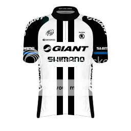
Trek Factory Cycling
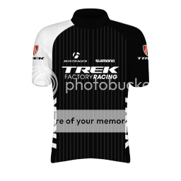
Which tool di you use to bend the shoulder sponsor by the way? Mine look kind of wrong..
|
| |
|
|
| mede33 |
Posted on 15-01-2014 15:48
|

Protected Rider

Posts: 1192
Joined: 21-03-2012
PCM$: 200.00
|
Vino : use Puppet Warp or the one i detailed in this tutorial : https://pcmfrance....65#p179765
The new PCM France : https://www.legruppetto.com/forum/viewforum.php?f=67
Just have a look, there's shirts and stages for you !
|
| |
|
|
| Ad Bot |
Posted on 19-06-2026 13:38
|
Bot Agent
Posts: Countless
Joined: 23.11.09
|
|
| IP: None |
|
|
| anderspcm |
Posted on 15-01-2014 15:58
|

Sprinter
Posts: 1707
Joined: 09-01-2010
PCM$: 200.00
|
It has been a long time since I've the "old" minishirt style, but I'm pretty sure I used the Arc tool 
|
| |
|
|
| kyle |
Posted on 15-01-2014 16:12
|
Neo-Pro
Posts: 311
Joined: 15-07-2011
PCM$: 200.00
|
I'm not sure, but I think it goes something like this..

And I know I'm missing some logos, on the bottom of the shorts and the back of the collar.. |
| |
|
|
| lollo345 |
Posted on 15-01-2014 16:13
|
Domestique
Posts: 594
Joined: 24-11-2013
PCM$: 200.00
|
great kyle
Edited by lollo345 on 15-01-2014 16:19
|
| |
|
|
| sutty68 |
Posted on 15-01-2014 16:20
|
Tour de France Champion

Posts: 34002
Joined: 22-08-2010
PCM$: 200.00
|
That is a good effort kyle |
| |
|
|
| lollo345 |
Posted on 15-01-2014 16:23
|
Domestique
Posts: 594
Joined: 24-11-2013
PCM$: 200.00
|
poiup11 wrote:
Your shirts are fantastic once again, kyle!
My first two minishirts:
Giant - Shimano
Trek Factory Cycling
Which tool di you use to bend the shoulder sponsor by the way? Mine look kind of wrong..
great
mede33: but veloman06 minimalloit does not do more?
poiup11: can you creat minimalloit: tinkoff saxo, cannondale and neri-sottoli yellow fluo?
Edited by lollo345 on 15-01-2014 16:27
|
| |
|
|
| mede33 |
Posted on 15-01-2014 16:50
|
Protected Rider
Posts: 1192
Joined: 21-03-2012
PCM$: 200.00
|
Veloman told me he will create minishirts for every WT and Conti Pro teams, but as he's busy for the moment, we have to be patient. Just wait, there will be done, don't worry.
The new PCM France : https://www.legruppetto.com/forum/viewforum.php?f=67
Just have a look, there's shirts and stages for you !
|
| |
|
|
| anderspcm |
Posted on 15-01-2014 16:57
|
Sprinter
Posts: 1707
Joined: 09-01-2010
PCM$: 200.00
|
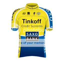
kyle wrote:
I'm not sure, but I think it goes something like this..
And I know I'm missing some logos, on the bottom of the shorts and the back of the collar.. I just checked the jersey ingame, it is very obvious that you don't use the viewer(guess you don't have the game), but there is a lot of mistakes on the jersey, and some of them are very obivous.
I've marked the mistakes on the pictures beneath.
- Tinkoff is almost not visible
- Shapes doesn't overlap

- Tinkoff is almost not visible
- Shapes doesn't overlap
- Saxo looks a bit weird, and "AX" needs to be overlapped

- The shape that is suppoed to end on the shoulders, ends on the front
- Logos needs to match the size like on the real jersey
- The bends of Tinkoff and Saxo could be improved a lot

- Shapes doesn't overlap at all, and it looks like it to seperate shapes
- Collar could be done a lot better, get's smaller in the end and doesn't seem to overlap

|
| |
|
|
| lollo345 |
Posted on 15-01-2014 16:59
|
Domestique
Posts: 594
Joined: 24-11-2013
PCM$: 200.00
|
mede33 wrote:
Veloman told me he will create minishirts for every WT and Conti Pro teams, but as he's busy for the moment, we have to be patient. Just wait, there will be done, don't worry.
ok |
| |
|
|
| poiup11 |
Posted on 15-01-2014 17:06
|
Free Agent
Posts: 124
Joined: 02-06-2010
PCM$: 200.00
|
Tinkoffâ¬
Edited by poiup11 on 15-01-2014 21:57
|
| |
|
|
| krisa |
Posted on 15-01-2014 17:15
|

Classics Specialist
Posts: 3892
Joined: 12-04-2011
PCM$: 200.00
|
Shorts Iam
|
| |
|
|
| kyle |
Posted on 15-01-2014 17:29
|
Neo-Pro
Posts: 311
Joined: 15-07-2011
PCM$: 200.00
|
Jesus  |
| |
|
|
| Jaywol |
Posted on 15-01-2014 18:31
|

Domestique
Posts: 722
Joined: 02-08-2008
PCM$: 200.00
|
anderspcm wrote:
kyle wrote:
I'm not sure, but I think it goes something like this..
And I know I'm missing some logos, on the bottom of the shorts and the back of the collar.. I just checked the jersey ingame, it is very obvious that you don't use the viewer(guess you don't have the game), but there is a lot of mistakes on the jersey, and some of them are very obivous.
I've marked the mistakes on the pictures beneath.
- Tinkoff is almost not visible
- Shapes doesn't overlap
- Tinkoff is almost not visible
- Shapes doesn't overlap
- Saxo looks a bit weird, and "AX" needs to be overlapped
- The shape that is suppoed to end on the shoulders, ends on the front
- Logos needs to match the size like on the real jersey
- The bends of Tinkoff and Saxo could be improved a lot
- Shapes doesn't overlap at all, and it looks like it to seperate shapes
- Collar could be done a lot better, get's smaller in the end and doesn't seem to overlap
Anderspcm, its that sort of bullshit criticism that puts people off making jerseys at all. Ever heard of constructive crticism ? Nice effort Kyle, I'm sure your jerseys will continue to improve the more familiar you become with the process. |
| |
|
|
| The Hobbit |
Posted on 15-01-2014 18:33
|

Small Tour Specialist
Posts: 2709
Joined: 18-08-2013
PCM$: 200.00
|
I think you shouldn't be so hard. Jaywol+Anderspcm 
Anders was clearly trying to help, and make that jersey better. He did not say it was rubbish, just pointed out some improvements, that's sort of the definition of constructive criticism. Maybe could've been worded a little better, but I think it is beneficial if someone points out some things to improve. |
| |
|
|
| kyle |
Posted on 15-01-2014 18:37
|
Neo-Pro
Posts: 311
Joined: 15-07-2011
PCM$: 200.00
|
People please don't freak about it.. I didn't take it as an insult to my work or anything.
@Jaywol Thanks for the support anyways xD |
| |
|
|
| anderspcm |
Posted on 15-01-2014 18:45
|
Sprinter
Posts: 1707
Joined: 09-01-2010
PCM$: 200.00
|
Jaywol wrote:
anderspcm wrote:
kyle wrote:
I'm not sure, but I think it goes something like this..
And I know I'm missing some logos, on the bottom of the shorts and the back of the collar.. I just checked the jersey ingame, it is very obvious that you don't use the viewer(guess you don't have the game), but there is a lot of mistakes on the jersey, and some of them are very obivous.
I've marked the mistakes on the pictures beneath.
- Tinkoff is almost not visible
- Shapes doesn't overlap
- Tinkoff is almost not visible
- Shapes doesn't overlap
- Saxo looks a bit weird, and "AX" needs to be overlapped
- The shape that is suppoed to end on the shoulders, ends on the front
- Logos needs to match the size like on the real jersey
- The bends of Tinkoff and Saxo could be improved a lot
- Shapes doesn't overlap at all, and it looks like it to seperate shapes
- Collar could be done a lot better, get's smaller in the end and doesn't seem to overlap
Anderspcm, its that sort of bullshit criticism that puts people off making jerseys at all. Ever heard of constructive crticism ? Nice effort Kyle, I'm sure your jerseys will continue to improve the more familiar you become with the process. Oh god, did you really think what I wrote is bullshit criticism? I'm pointing everything that could be improved, therefore my criticism is constructive, I'm not just trying to just be "mean", I was trying to help 
Edited by anderspcm on 15-01-2014 18:48
|
| |
|
|
| aidanvn13 |
Posted on 15-01-2014 18:52
|

Classics Specialist
Posts: 2786
Joined: 06-11-2010
PCM$: 200.00
|

|
| |
|
|
| Maddrengen |
Posted on 15-01-2014 19:34
|
Protected Rider
Posts: 1234
Joined: 10-08-2010
PCM$: 200.00
|
Jaywol, that's really a bunch of "bullshit" (to use your own words). AndersPCM puts out some really vital problems on this shirt, which is the overlapping of shapes and logos. Thats the most of the shirts look ingame, and since he even arguments with pictures, it's more than just a bit constructive.
@Kyle, i advise you to follow Anders' words, even though the stupidity of Jaywol. And to watch his bending tool guide, and use it your best! His way is (almost) the best and easiest way! And then use the editor, if you know how, otherwise i'd gladly help you learn how to. I hope you'll fix the mistakes on this jersey, and give us a final version, 'cause i know you can do better, senn it myself!
KIU!!
Edited by Maddrengen on 15-01-2014 19:35
|
| |
|