|
PCM09 Fantasy Jerseys
|
| Inferio |
Posted on 06-08-2009 15:46
|

Domestique

Posts: 685
Joined: 31-12-2008
PCM$: 200.00
|
jb08 wrote:
My first attempt at a Jersey, comment please... (oops triple post)
Oh, I like it  |
| |
|
|
| ElvisGrbac |
Posted on 06-08-2009 15:57
|
Under 23

Posts: 74
Joined: 10-02-2007
PCM$: 200.00
|
Second attempt  Comments please. I want to improve my skills Comments please. I want to improve my skills 
EDIT: Please look beyond the fact, that I screwed up with the edge of the shirt

Edited by ElvisGrbac on 06-08-2009 15:59
|
| |
|
|
| CrueTrue |
Posted on 06-08-2009 16:05
|

Tour de France Champion

Posts: 27880
Joined: 20-10-2006
PCM$: 200.00
|
2nd? You're talented!
I like it a lot. |
| |
|
|
| ElvisGrbac |
Posted on 06-08-2009 16:15
|
Under 23

Posts: 74
Joined: 10-02-2007
PCM$: 200.00
|
CrueTrue wrote:
2nd? You're talented!
I like it a lot.
Thanks mate...I used to make shirts for Football Manager a couple years ago, but never made anything for PCM before today  |
| |
|
|
| G_Larsson |
Posted on 06-08-2009 17:22
|

Sprinter

Posts: 1745
Joined: 25-03-2007
PCM$: 200.00
|
Yeah, awesome shirt ElvisGrbac! 
Team Manager of Team IKEA-Bianchi
[url=(color=#0000ff] Team Info[/url]
Media Room
You'll Never Walk Alone |
| |
|
|
| pma1309 |
Posted on 06-08-2009 19:00
|
Junior Rider

Posts: 42
Joined: 26-07-2008
PCM$: 200.00
|
Heh.. glad it was late and not never  . Thank's a lot mate looking great!. now all I need is the new pcmdaily DB . Thank's a lot mate looking great!. now all I need is the new pcmdaily DB  . .
Edited by CrueTrue on 06-08-2009 20:13
|
| |
|
|
| binga58 |
Posted on 06-08-2009 23:12
|

Neo-Pro

Posts: 339
Joined: 03-08-2008
PCM$: 200.00
|
Elvis- How do yo u get that white steak across the red maccas jersey? |
| |
|
|
| GrahamZ |
Posted on 07-08-2009 04:43
|
Junior Rider

Posts: 29
Joined: 11-07-2009
PCM$: 200.00
|
How does everyone get their sponsor logos to look so good but mine look like crap?! Yeeeesh.... |
| |
|
|
| djconnel |
Posted on 07-08-2009 06:26
|
Junior Rider

Posts: 41
Joined: 07-08-2009
PCM$: 200.00
|
Ezeefreak wrote:
My first Creation of Team RadioShack...
Nice work! But now it's "The Shack":
https://www.radios.../theshack/ |
| |
|
|
| ElvisGrbac |
Posted on 07-08-2009 12:27
|
Under 23

Posts: 74
Joined: 10-02-2007
PCM$: 200.00
|
binga58 wrote:
Elvis- How do yo u get that white steak across the red maccas jersey?
Just used some downloaded brushes  |
| |
|
|
| Ad Bot |
Posted on 01-05-2026 14:41
|
Bot Agent
Posts: Countless
Joined: 23.11.09
|
|
| IP: None |
|
|
| ElvisGrbac |
Posted on 07-08-2009 13:13
|
Under 23

Posts: 74
Joined: 10-02-2007
PCM$: 200.00
|
Just redone my attempt at an Adria Mobil jersey for my career.
Comments please  Where should I improve? Where should I improve?

Edited by ElvisGrbac on 07-08-2009 13:26
|
| |
|
|
| ElvisGrbac |
Posted on 07-08-2009 16:42
|
Under 23

Posts: 74
Joined: 10-02-2007
PCM$: 200.00
|
And here's my Lithuanian champ jersey for Adria (just signed a Lithuanian megatalent)
 |
| |
|
|
| Kami |
Posted on 07-08-2009 16:49
|

Classics Specialist

Posts: 3386
Joined: 19-06-2009
PCM$: 200.00
|
I still sthink that the team will be named Team Radioshack, The Shack is just a VERY lame nickname.
Edited by CrueTrue on 07-08-2009 17:14
|
| |
|
|
| Will007 |
Posted on 07-08-2009 17:29
|

Breakaway Specialist

Posts: 772
Joined: 03-10-2008
PCM$: 200.00
|
ElvisGrbac wrote:
And here's my Lithuanian champ jersey for Adria (just signed a Lithuanian megatalent)

Not quite sure about the colors on the shorts, and the Adria logo on the side of the jersey to the left need a white or black stroke (1-2 px).
Beside that it's a fine jersey. |
| |
|
|
| jolly_antunes |
Posted on 08-08-2009 00:47
|

Sprinter

Posts: 1855
Joined: 14-08-2007
PCM$: 200.00
|

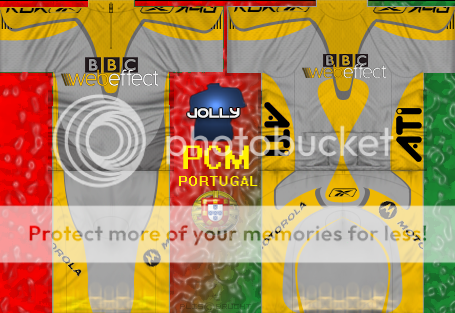
Made by me.
|
| |
|
|
| ElvisGrbac |
Posted on 08-08-2009 17:29
|
Under 23

Posts: 74
Joined: 10-02-2007
PCM$: 200.00
|
Newest - Team Eircom
 |
| |
|
|
| djconnel |
Posted on 09-08-2009 05:12
|
Junior Rider

Posts: 41
Joined: 07-08-2009
PCM$: 200.00
|
Okay... here's my attempt. I run linux so neither have the game nor the jersey previewer, so this is simply an exercise in 3d rendering of a jersey concept. For Team Roaring Mouse in San Francisco, CA (of which I'm a member).
If someone could run this through the previewer and post a few shots (or send them to me privately), I'd be quite grateful....
I did the design with Gimp. One trick I picked up is for the black shorts is to reverse-image the template and place it above the template multiplication layer rather than to use black, which would obscure the folds. Same for the neck with the zipper. I did not do this with the black regions of the jersey front and back: left for further work.
I hope this is good. I assume the sleeve logos should be reflected about a line 7 pixels from the top of the image. But that's just a guess. The sleeves may well crash and burn on this one....

updated: I made changes consistent with what I saw in the preview. The BBC jersey has minimal pixel filling: that is a clue to the true bounds of the shorts. I suspect it's better to fill past the boundaries, however, to facilitate smoothing for distance rendering, as hinted by the fact the template extends beyond these boundaries.
Edited by djconnel on 09-08-2009 18:48
|
| |
|
|
| CrueTrue |
Posted on 09-08-2009 14:51
|

Tour de France Champion

Posts: 27880
Joined: 20-10-2006
PCM$: 200.00
|
I've attached some screens of the shirt. I used PCM.daily's Shirt Viewer Tool, though.
|
| |
|
|
| djconnel |
Posted on 09-08-2009 16:08
|
Junior Rider

Posts: 41
Joined: 07-08-2009
PCM$: 200.00
|
CrueTrue wrote:
I've attached some screens of the shirt. I used PCM.daily's Shirt Viewer Tool, though.
Wow -- thanks! Lessons learned:
* I've got to find a machine to run that previewer! (Mac or Windows) Very useful[*]I'd figured out the wrapping on the sleeves, but the mapping makes the letters appear compressed.
* My "trick" on the shorts of inverting the template to make highlights on black overdoes the highlights: it looks too much like silk. I need to reduce those highlights.
* I probably don't need to worry about transferring highlights to the black on the jersey.
* The shorts have a similar issue as the shoulders, where there are some pixels which map to neither the front nor the back.
It's evident the reason for the duplicate pixels on the shorts and the sleeves and the side panels is to facilitate local pixel averaging when the camera is further away.... This way to find the average of pixels in the neighborhood of a given pixel the algorithm can use pixels in a given neighborhood of the map (for example, by creating lower-resolution images of the map at the start) rather than by averaging pixels selectively chosen from different regions of the map.
But these preview images tell me what I need to know.
Thanks, again!
added: I made changes in the design (same URL).
Edited by djconnel on 09-08-2009 18:50
|
| |
|
|
| Inferio |
Posted on 09-08-2009 22:25
|

Domestique

Posts: 685
Joined: 31-12-2008
PCM$: 200.00
|
Hello,
I've already made one shirt about one month ago, which I use in PCM now, but it looks quite amateur:

So I decided to please Will007 to make me jersey, the result is great, so in future I'll use this jersey for my team: https://www.pcmdaily.com/forum/viewthr...ost_230585
Today I've made one jersey just for fun, maybe I'll use it for some occasions... I try to keep it very dirty 

Please comments on both my jerseys 
Edited by Inferio on 10-08-2009 13:28
|
| |
|


 Comments please. I want to improve my skills


